
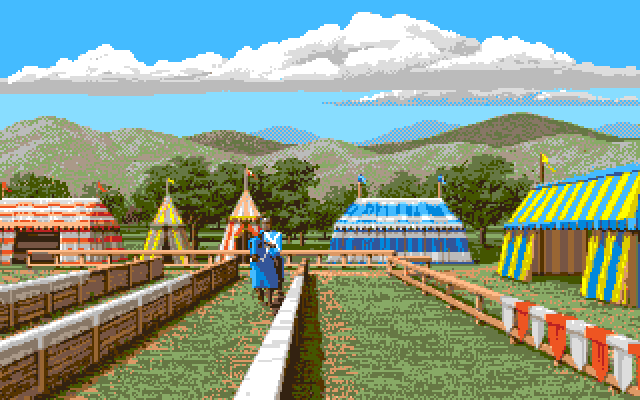
From Defender of the Crown 2

From Defender of the Crown CDTV

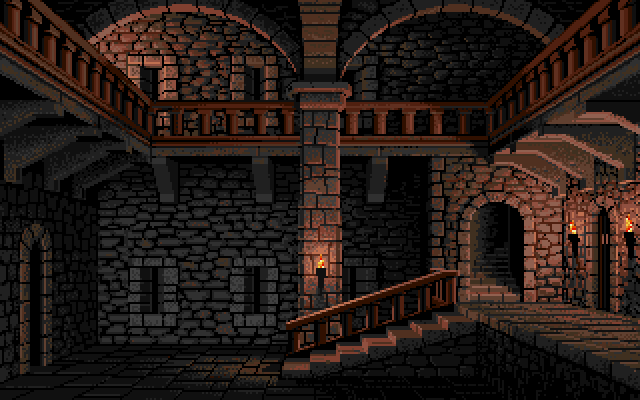
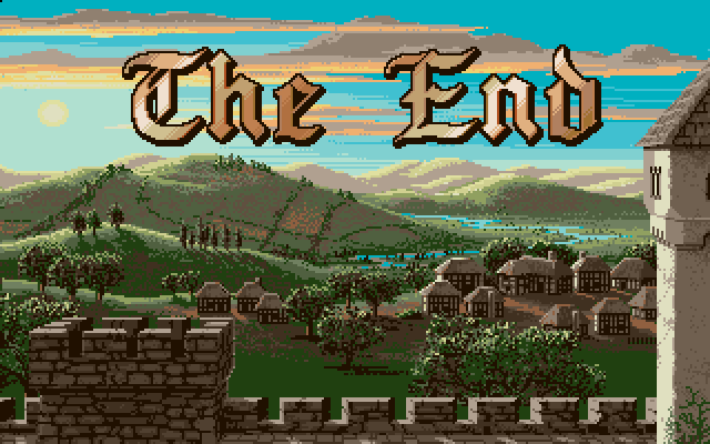
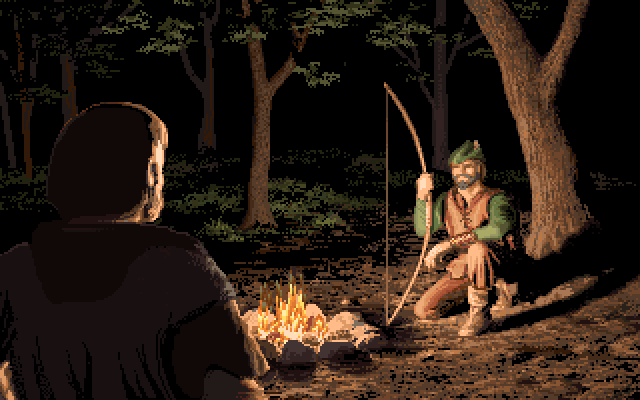
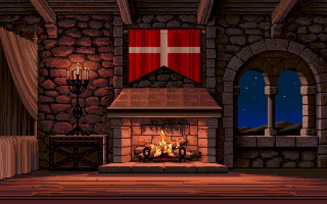
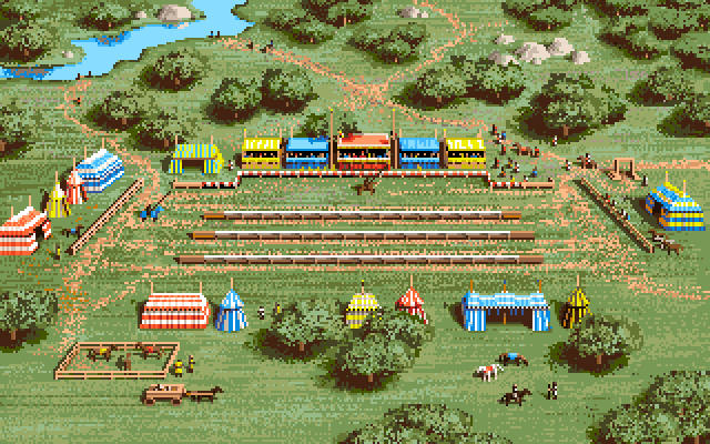
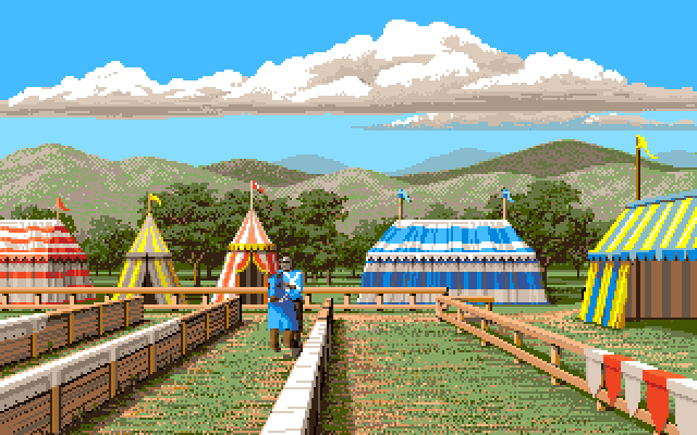
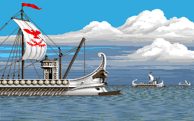
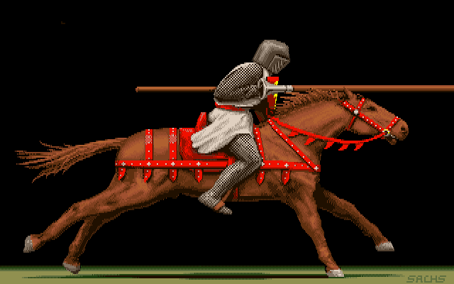
From Defender of the Crown

From Defender of the Crown 2

From Defender of the Crown 2
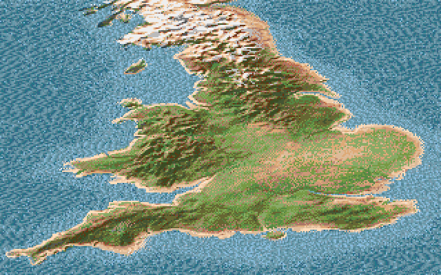
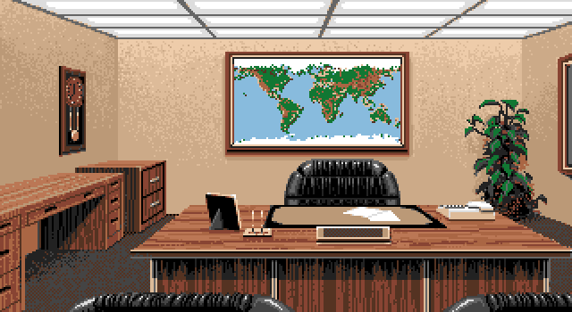
The hand painted map from Defender of the Crown was replaced by a picture that was grabbed from video and touched up.
This was a technique that Jim used more often in his later work to speed up his workflow, because pixeling everything by hand took a lot of time, which was rarely available when developing a game.

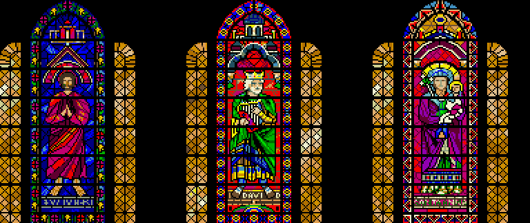
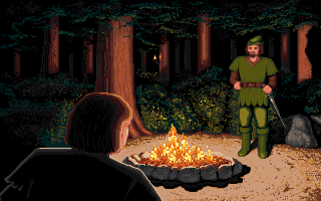
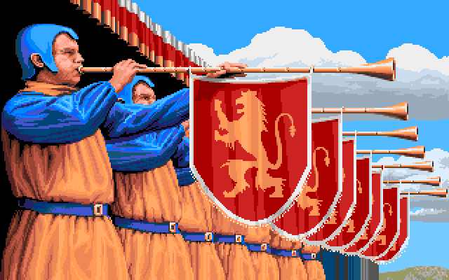
From Defender of the Crown

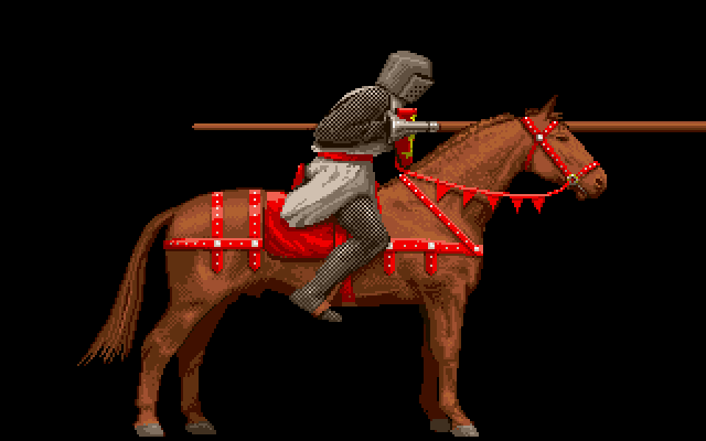
From Defender of the Crown 2

From Defender of the Crown 2
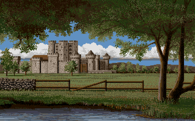

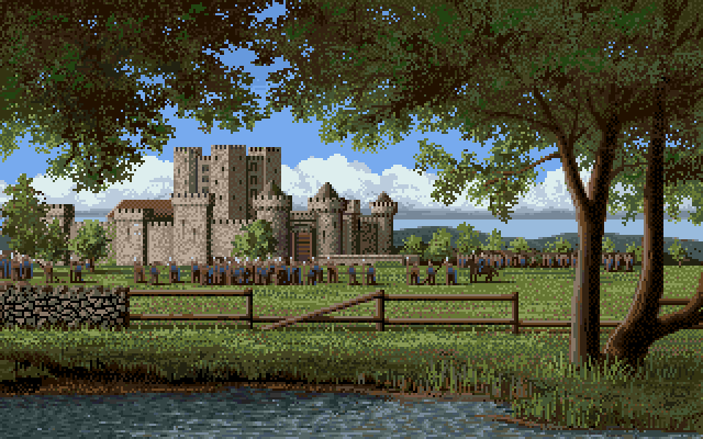
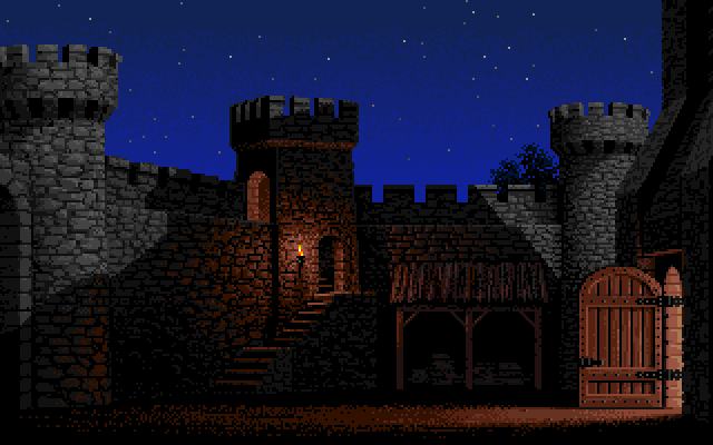
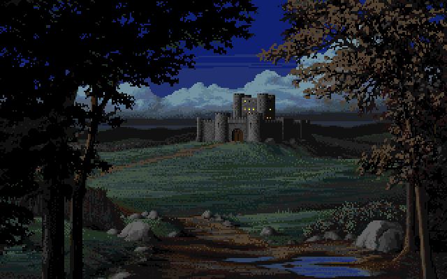
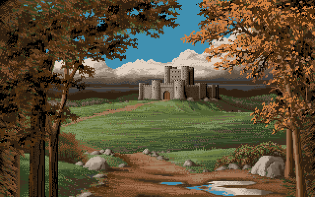
From Defender of the Crown with a day time palette.
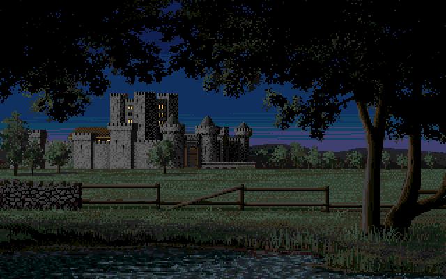
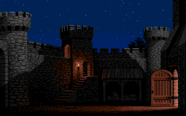
The castle pictures from Defender of the Crown used the same picture but with different color palettes for the day and night time versions.
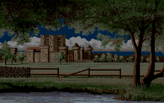

From Defender of the Crown with a night time palette

From Defender of the Crown 2

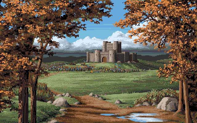
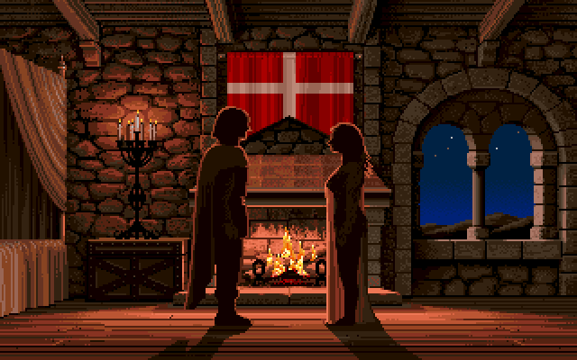
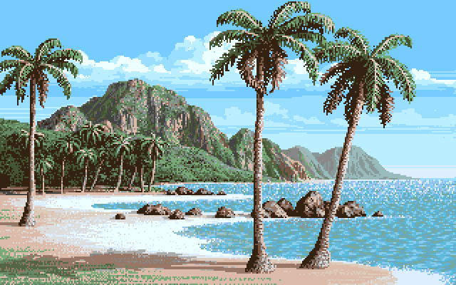
From Defender of the Crown


From Defender of the Crown 2

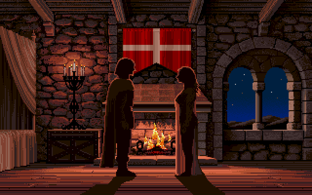
From Defender of the Crown

From Defender of the Crown 2

From Defender of the Crown

From Defender of the Crown 2

From Defender of the Crown 2

From Defender of the Crown with a day time palette.
The castle pictures from Defender of the Crown used the same picture but with different color palettes for the day and night time versions.
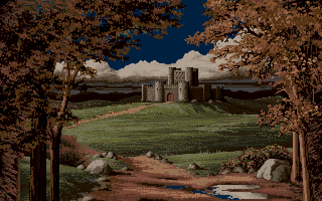

From Defender of the Crown with a night palette.


From Defender of the Crown 2

From Defender of the Crown

From Defender of the Crown

From Defender of the Crown, background only

From Defender of the Crown 2
Jim posted a complete version of the Defender of the Crown 2 ending on his personal YouTube channel.
From Defender of the Crown 2


From Defender of the Crown 2

From Defender of the Crown

From Defender of the Crown 2.

From Defender of the Crown.
This image was not drawn by Jim Sachs and he was not happy with it. He therefore created a completely new version for Defender of the Crown 2.

From Defender of the Crown 2

From Defender of the Crown

From Defender of the Crown - Background Only

From Defender of the Crown 2

From Defender of the Crown

From Defender of the Crown 2

From Defender of the Crown

From Defender of the Crown 2

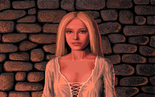
From Defender of the Crown

From Defender of the Crown
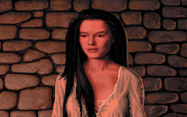
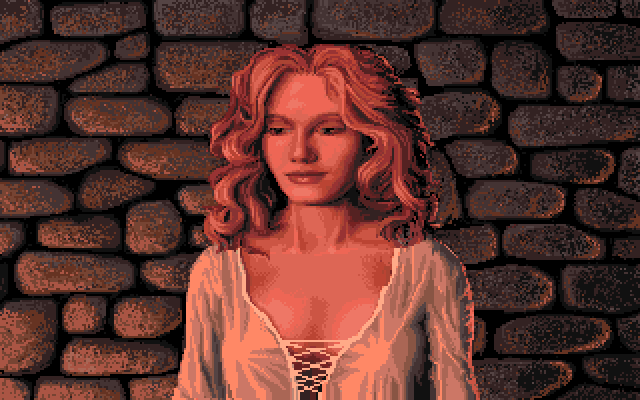
Interestingly two of the four maidens were left out for Defender of the Crown 2, with Lady Rebecca being one of them.

From Defender of the Crown
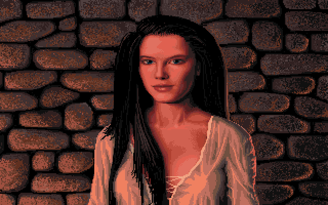
Interestingly two of the four maidens were left out of Defender of the Crown 2, with Lady Rosalind being one of them.

From Defender of the Crown 2

From Defender of the Crown 2

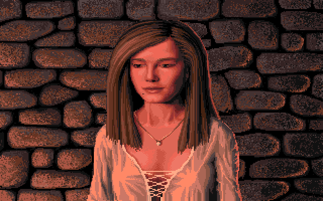
From Defender of the Crown

From Defender of the Crown 2

From Defender of the Crown

From Defender of the Crown 2.

From Defender of the Crown.

From Defender of the Crown 2

From Defender of the Crown

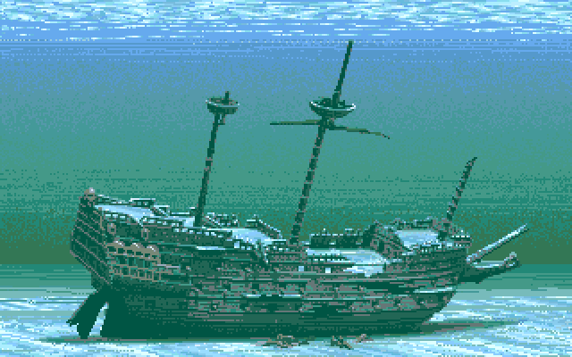


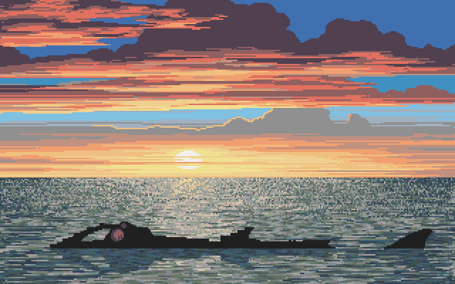

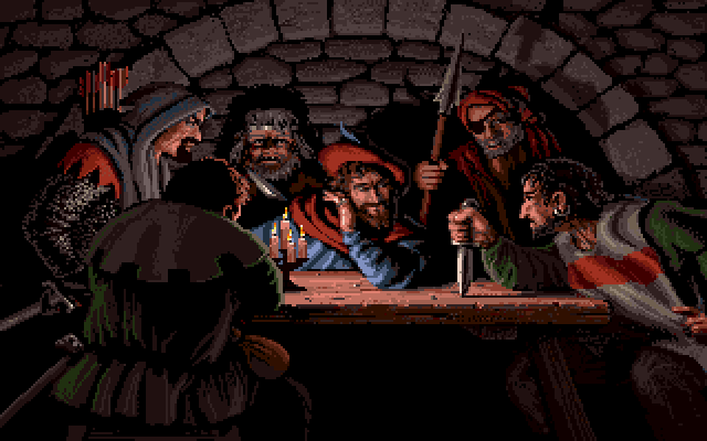
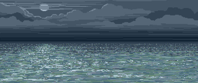
This image belonged to a sequence where the Nautilus can be seen sinking slowly in the sunset. Jim captured this sequence from a VHS recording that he had made from the game demo during development and posted it on his personal YouTube channel.
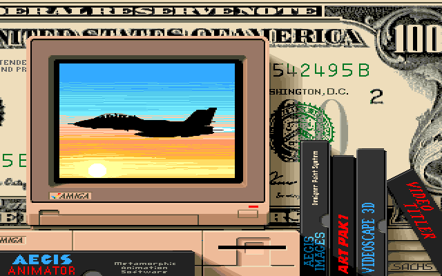


Used in the "Amiga Dealer" demo. It was produced by Commodore to promote Amigas that were on display in shops.
This image was shown in the "Amiga Features" part.


Used in the "Amiga Dealer" demo. It was produced by Commodore to promote Amigas that were on display in shops.
This image was shown in the "Art & Graphics" part.

Used in the "Amiga Dealer" demo. It was produced by Commodore to promote Amigas that were on display in shops.
This image was shown in the "Video" part.

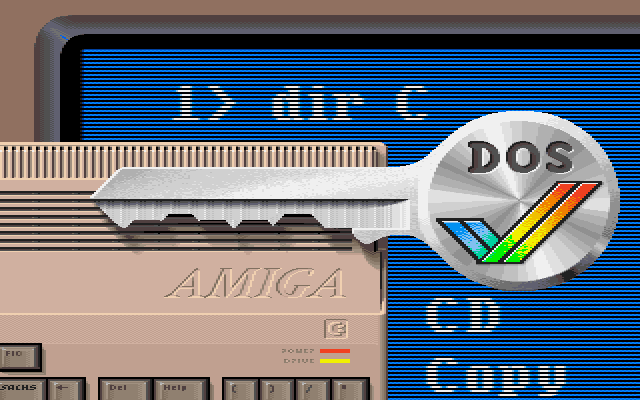
Used in AmigaVision tutorial (1990)

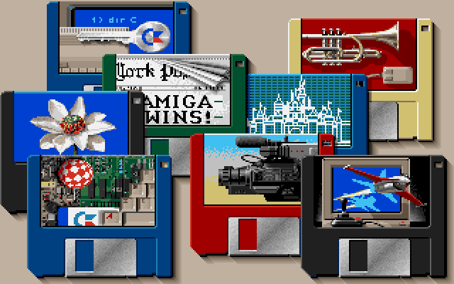
Use in Amiga demo
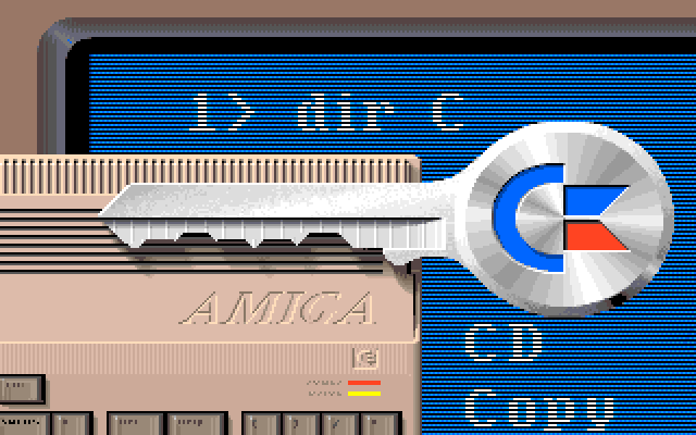
Used in the "Amiga Dealer" demo. It was produced by Commodore to promote Amigas that were on display in shops.[br]This image was shown in the "Music" part.

Used in the "Amiga Dealer" demo. It was produced by Commodore to promote Amigas that were on display in shops.
This image was shown in the "Entertainment" part.

The version was used in Commodore's "Amiga Dealer" demo.

The version used in Rob Peck's "Amiga Companion" book.
Used in the "Amiga Dealer" demo. It was produced by Commodore to promote Amigas that were on display in shops.
This image was shown in the "Education" part.
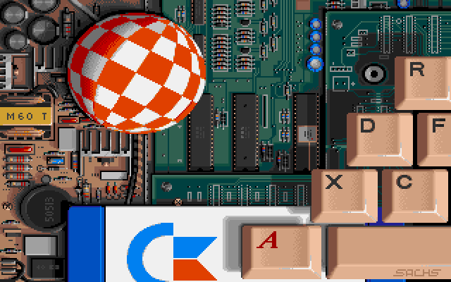
Interestingly there was also a version of this image that was used for the "Amiga Companion" book by Rob Peck. The biggest difference between the two was the peacock on the key, that was replaced by the Amiga rainbow check logo.
The Amiga Companion version is lowres-interlaced, which leads me to think that it was created first and the Amiga Demo version was downscaled to fit with the other images.

Used in the "Amiga Dealer" demo. It was produced by Commodore to promote Amigas that were on display in shops.
This image was shown in the "Products" part.


This is the official boot screen from Commodore's CDTV Amiga. It differs a bit from the Anim version that is circulating the web, possibly because of size constraints within the boot roms.
It doesn't work that well as gif animation as most browsers don't play it back at the correct speed.


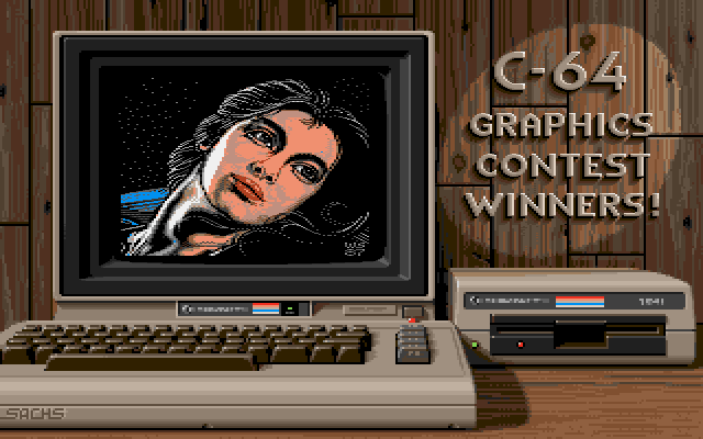

Commodore C64, 1702 Monitor, 1541 Floppy Drive
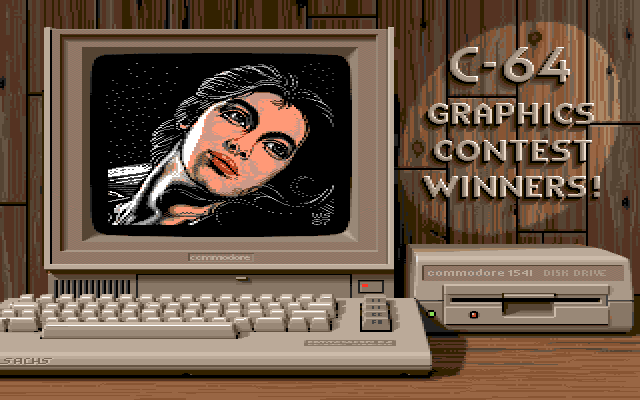

Commodore C64C, 1802 Monitor, 1541C Floppy Drive
Showing a rendition of Wayne Schmidt's 1987 C64 artwork called "Serene".


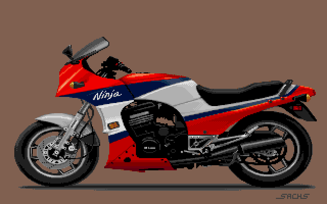

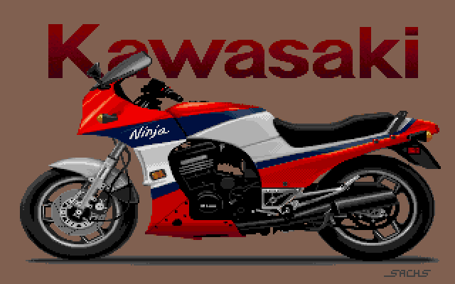
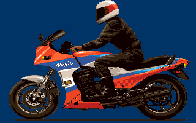
The variation with rider is a little strange, since the motorcycle seems to be slightly color reduced, despite the rider himself not really needing/using any additional colors. I currently can't say if Jim did this variation himself or for what this version was used for.
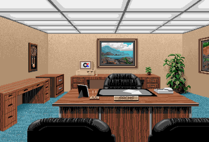
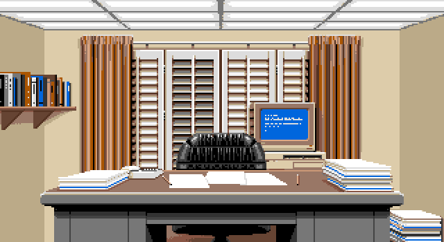
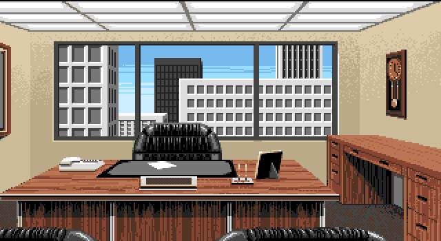
This is an office scene that was included in Ports of Call. It matches the Office 3D image closely, but uses fewer colors an has less details.
This image looks like an extended version of an image used in the game Ports of Call.
Most notable changes are the larger screen area and the increase in colors used.


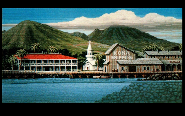
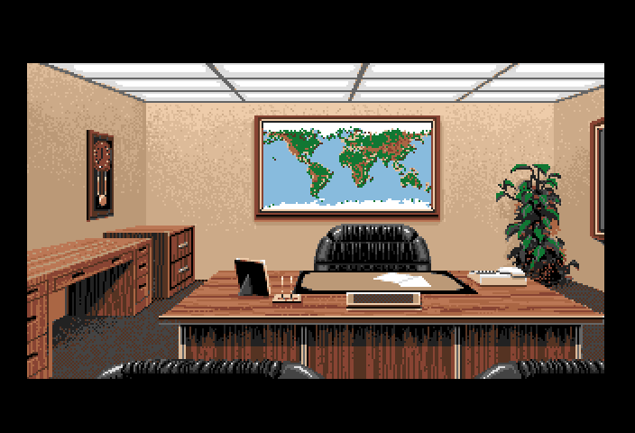
Jim re-used the title picture for Ports of Call in his abandoned [link=/game/20000LeaguesUnderTheSea.html]20.000 Leagues under the Sea[/link] project.
The german magazine Amiga Magazin did an article on Jim Sachs in their August 1989 issue. They previewed a screen from the project, while it was still in development, and you can clearly see the same sky, mountains and buildings.
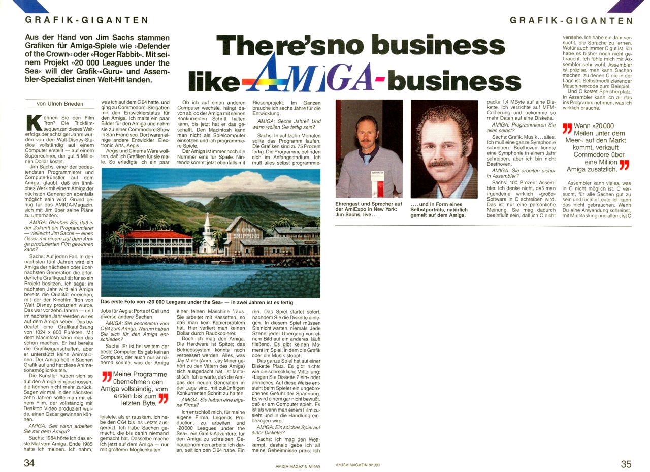


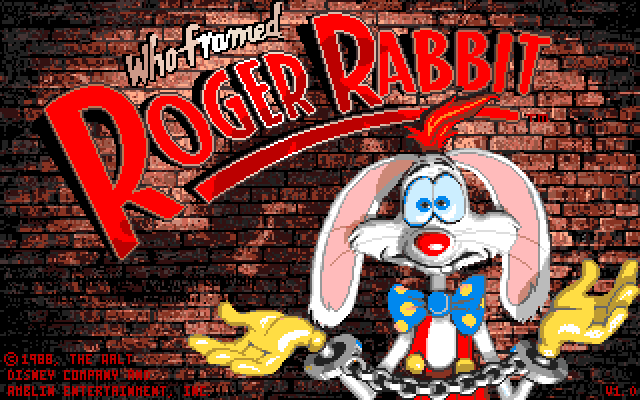

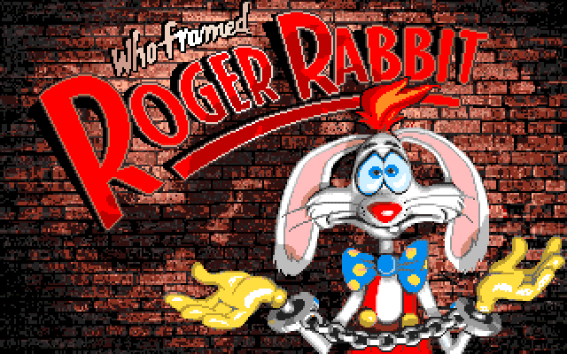
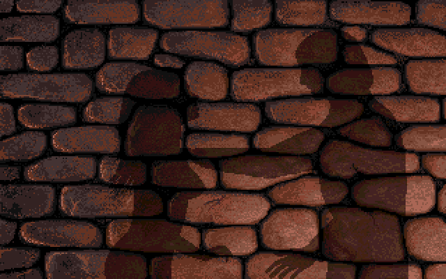
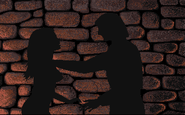
The work in progress is interesting as it shows several changes to the final image from the game.
Roger's head and left hand was changed, as was the expression in his face.
If you look closely it is also visible that the copyright message was moved from the center left side to the lower left side, since the text was colored black instead of removing it properly from the brick wall.
The small artifacts scattered around the brick wall are mostly my fault, because I had to reconstruct the wip image from a badly rescaled version that I found on the internet.