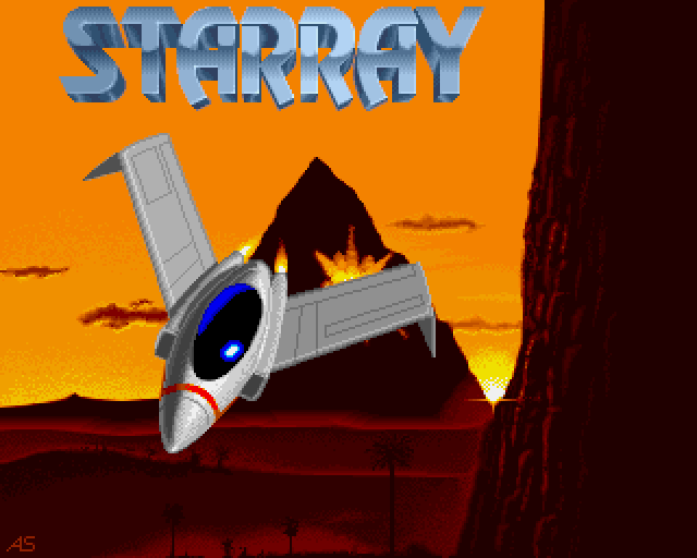


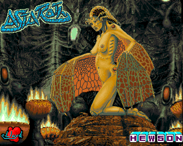
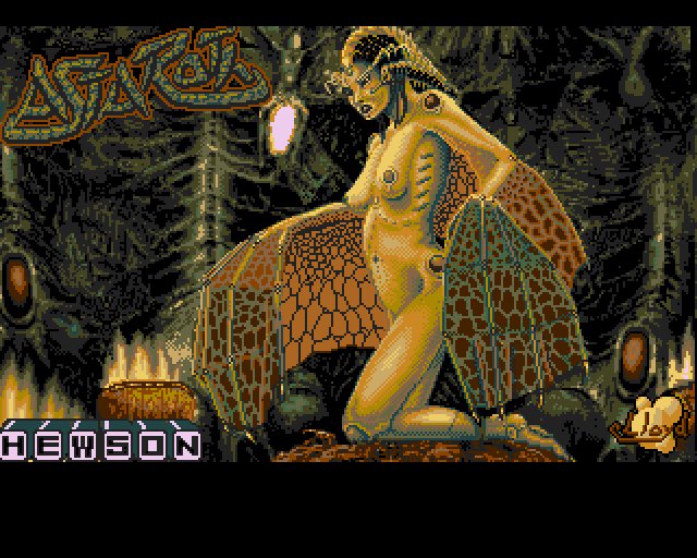
The copper was used to switch the color registers between the logo and the rest of the image. Nearly all palette entries are changed, except the orange background colors which have to remain the same between both palettes so that the switch doesn't get noticed.
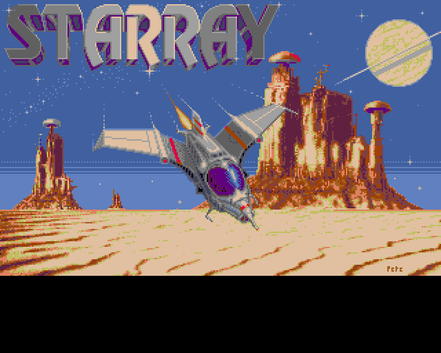
Interestingly the Amiga version of Starray had completely different and much more modern graphics than the steam punk styled Atari ST version, done by Pete Lyon.
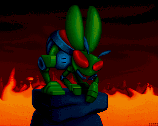


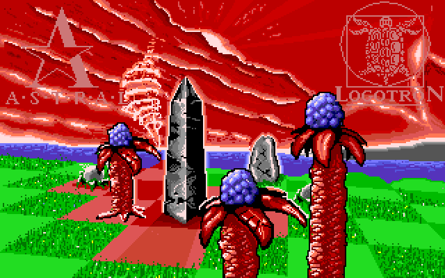
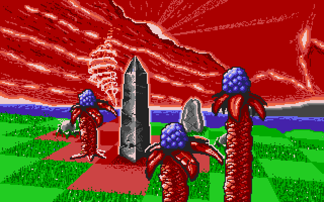
Based on original art created by Tim White


A variation of the droplet logo with only blue droplets.

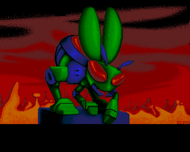
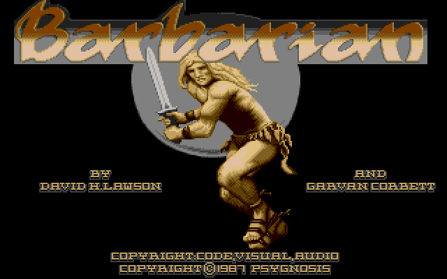
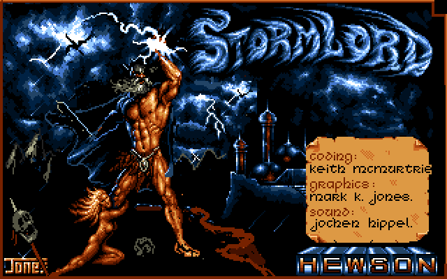
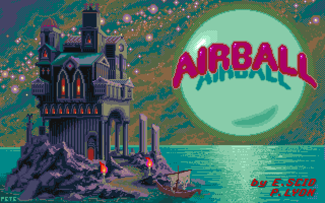
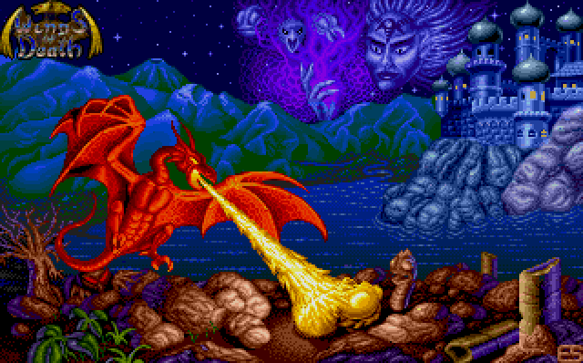
EU version
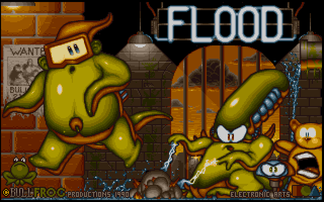
The highly optimized 16 color version was upgraded to 32 colors, but only a hand full of those colors were actually used and even those could have been further reduced.

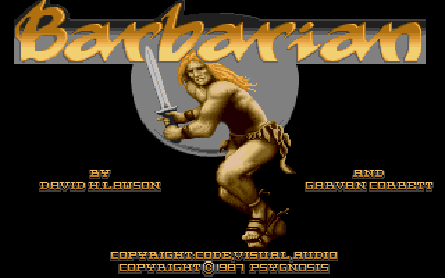
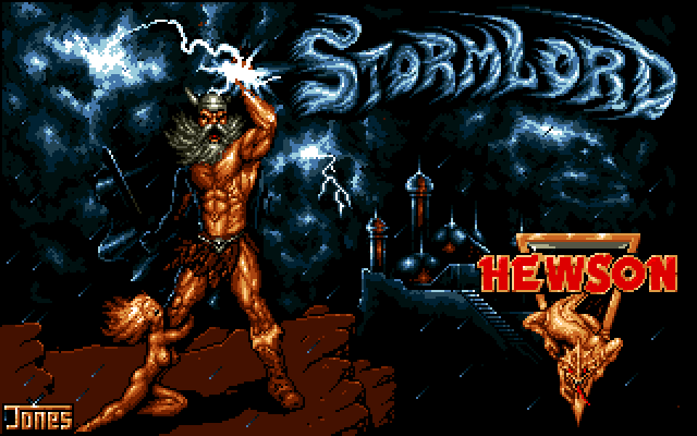
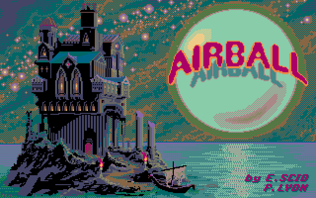
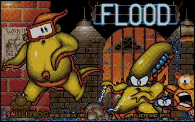
US version
Sadly some really poor edits were done to the US version of the title. Not sure why, but maybe someone felt the image was a bit too agressive / explicit.
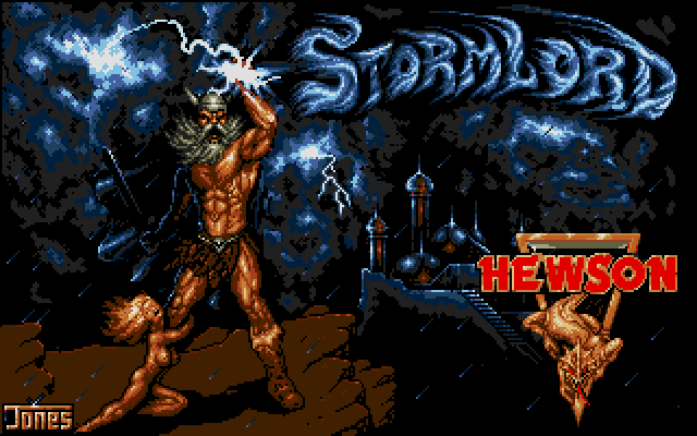


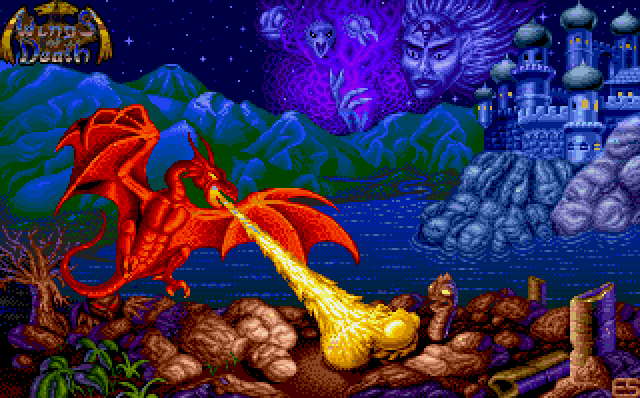
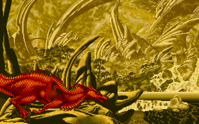
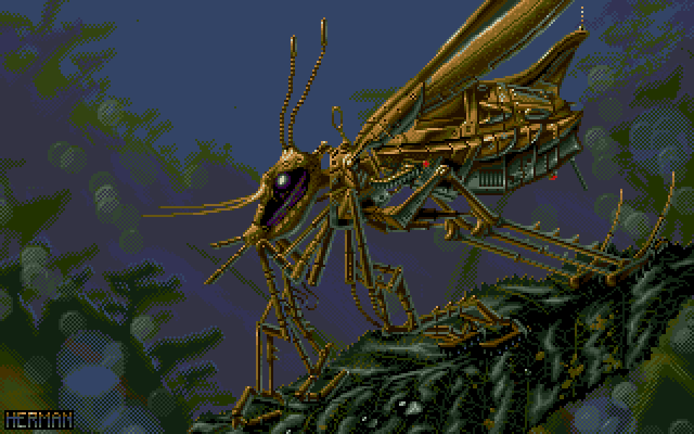
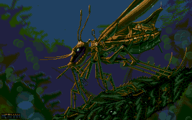
This images uses some crazy amount of copper trickery to extend the 16 base colors to a total of over 120 colors.
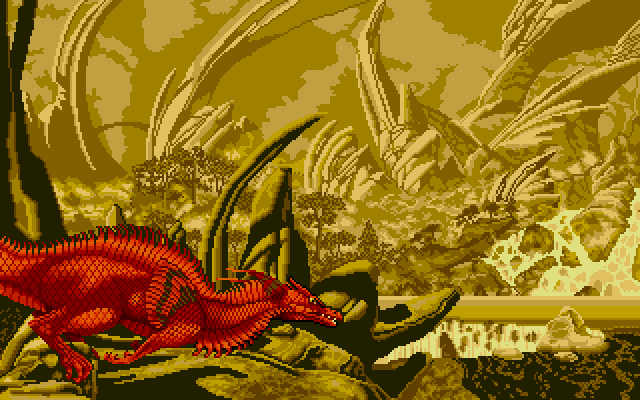
But the Amiga version falls behind in comparison to the Atari ST version where over 150 colors are created, despite the Atari ST's lack of a copper chip.