
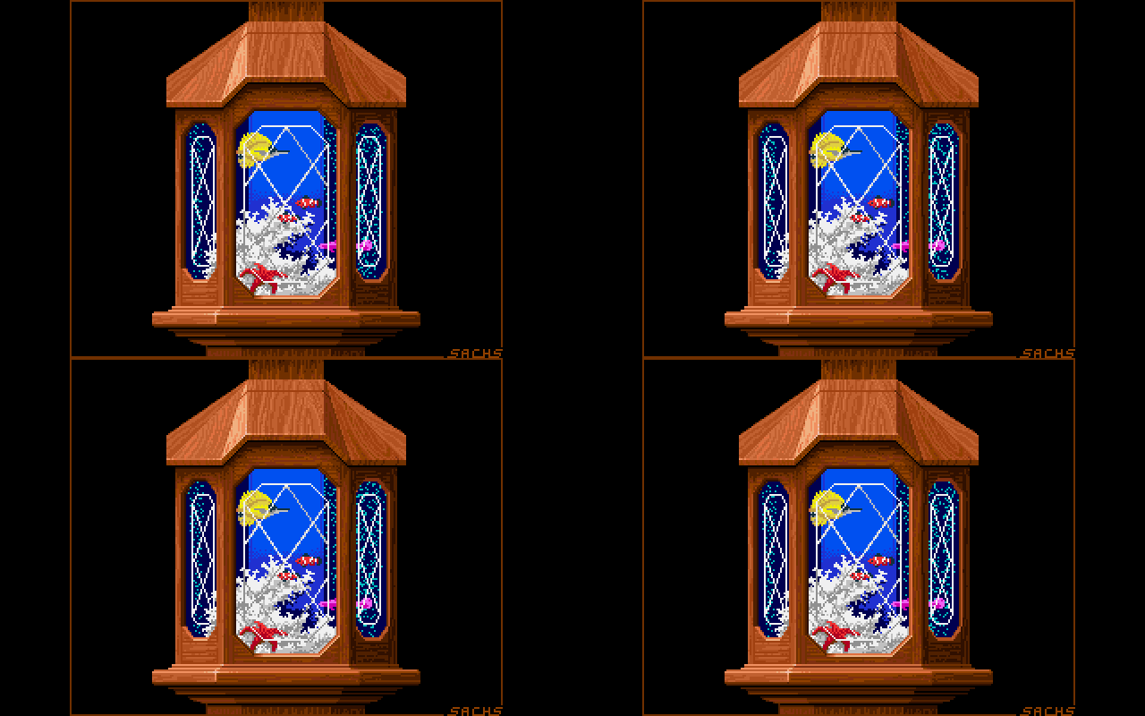

Amiga Graphics ArchiveArtistsJim Sachs CRT About Links

Jim Sachs

Jim Sachs is probably the most well known artist on the Amiga. Not only because he created breathtakingly beautiful graphics for games like Defender of the Crown and Ports of Call, but also because he created a lot of promotional art and magazine covers that were re-used all over the place to promote the Amiga.

He concentrated on architecture while in colledge, but went to the Air Force to fly C-141 Starlifter cargo planes after graduating.
After that he got into computer graphics through the C64 and then switched to the Amiga when that came out.
Interview: Amazing Computing (1987)
Interview: Amazing Computing (1994)


DefenderOfTheCrown2
DefenderOfTheCrownCDTV
DefenderOfTheCrown
  • Defender of the Crown 2
  • Amiga
  • Defender of the Crown (CDTV)
  • Prequel
  • Defender of the Crown
  • IFF
  • Prequel

  • Amiga
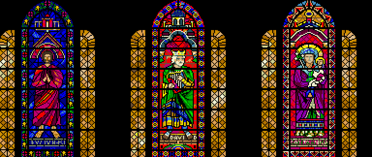
DefenderOfTheCrown2_Finale_StainedGlass
From Defender of the Crown 2

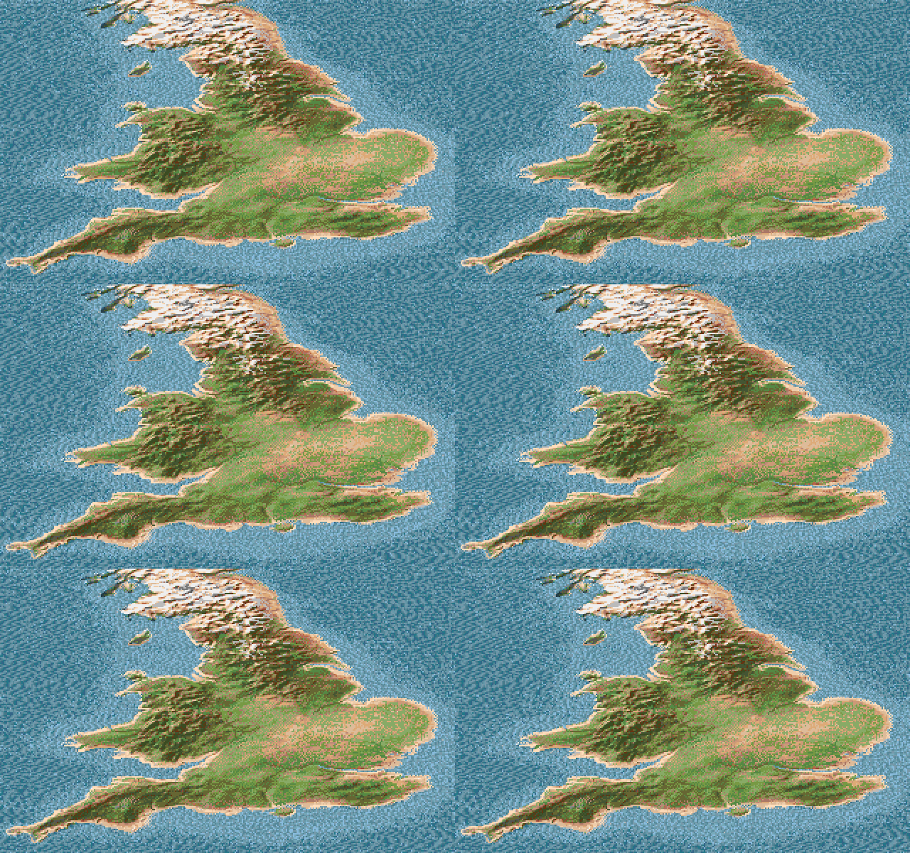
DefenderOfTheCrown2_BritainMap
DefenderOfTheCrown_BritainMap
  • From Defender of the Crown 2
  • Amiga
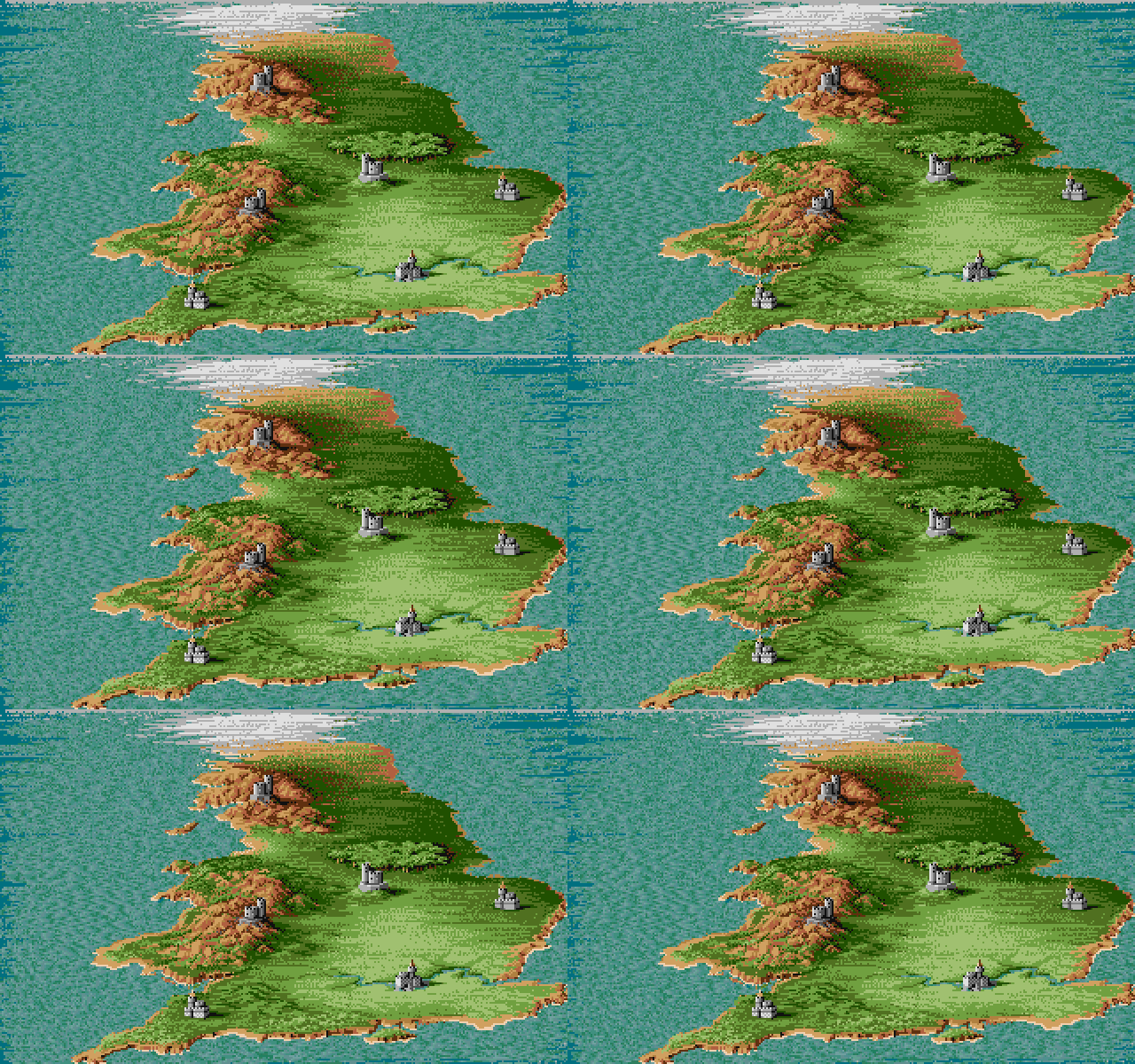
The hand painted map from Defender of the Crown was replaced by a picture that was grabbed from video and touched up.

This was a technique that Jim used more often in his later work to speed up his workflow, because pixeling everything by hand took a lot of time, which was rarely available when developing a game.

  • From Defender of the Crown
  • IFF
  • Prequel

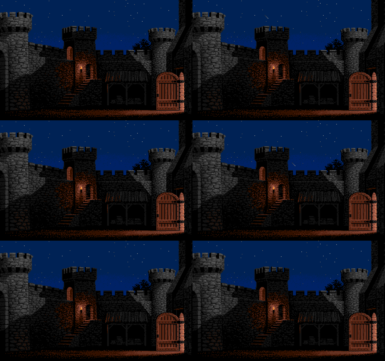
DefenderOfTheCrown2_CastleNorman_day
DefenderOfTheCrown2_CastleNorman_night
DefenderOfTheCrown_CastleNorman_day
DefenderOfTheCrown_CastleNorman_night
  • Defender of the Crown 2 - Day time palette
  • Amiga
  • Defender of the Crown 2 - Night time palette
  • IFF
  • Variation
  • Defender of the Crown - Day time palette
  • IFF
  • Prequel
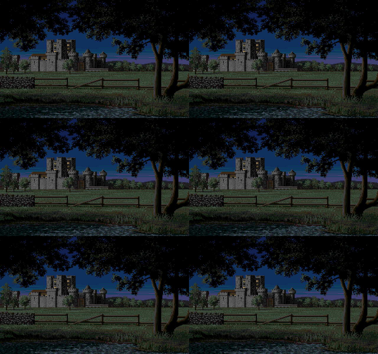
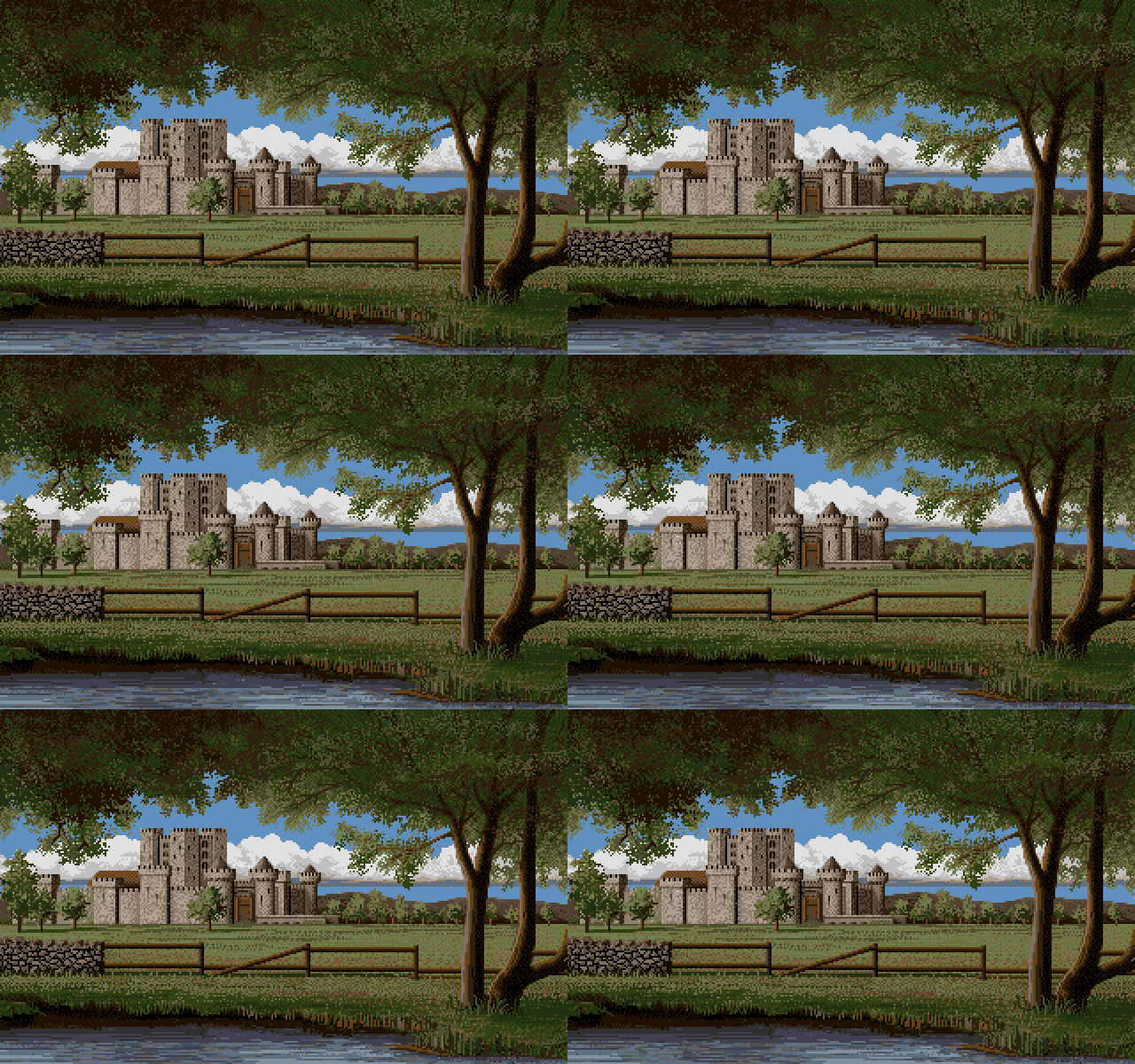
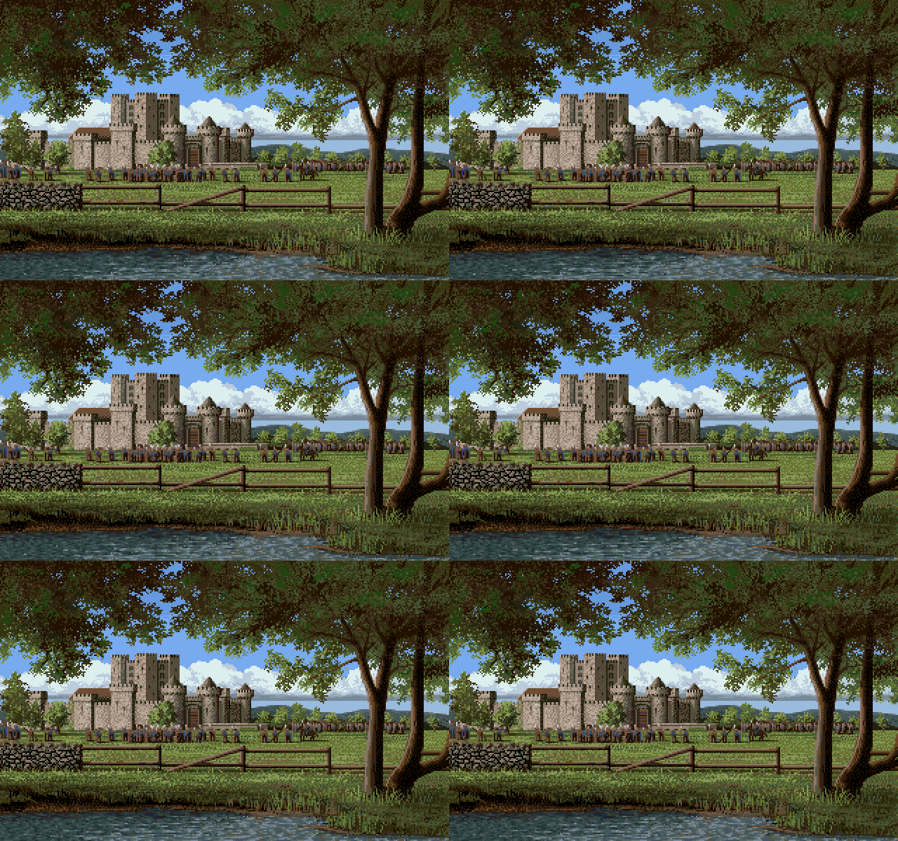
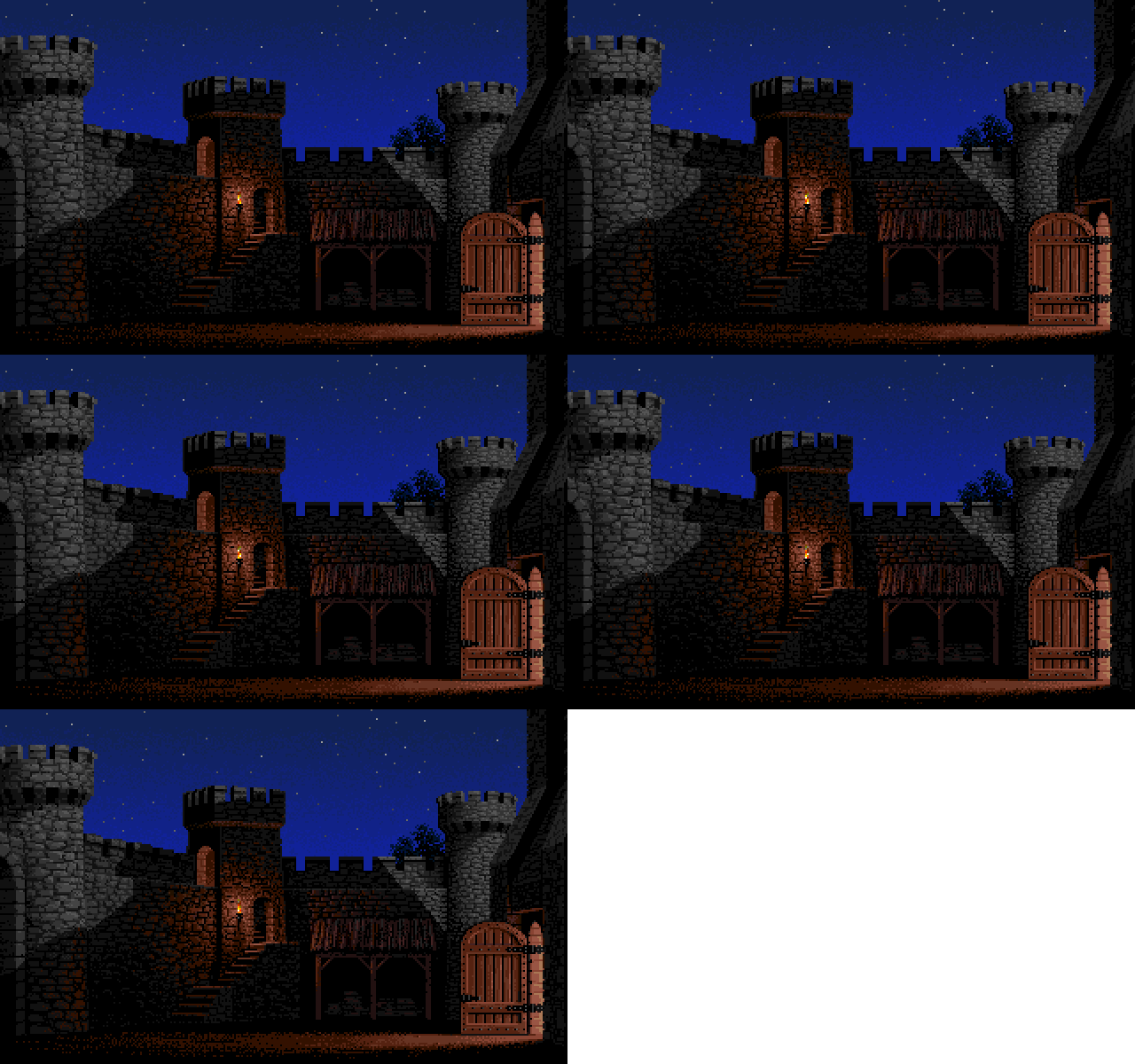
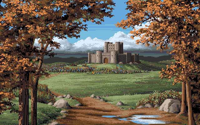
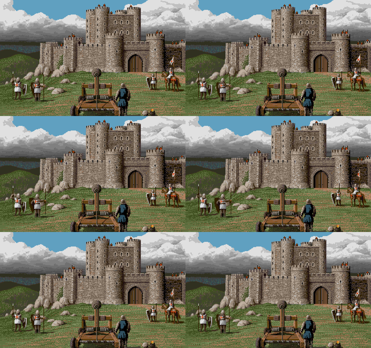
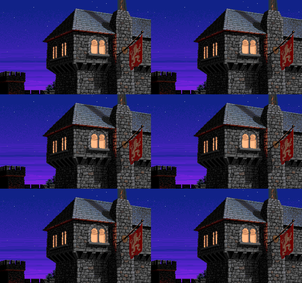
The castle pictures from Defender of the Crown used the same picture but with different color palettes for the day and night time versions.

  • Defender of the Crown - Night time palette
  • IFF
  • Prequel

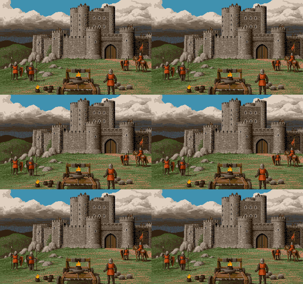
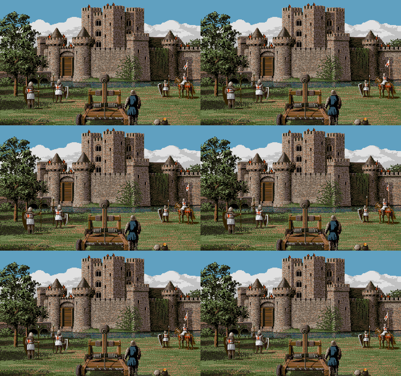
DefenderOfTheCrown2_CastleNormanCatapult
DefenderOfTheCrown_CastleNormanCatapult
  • Defender of the Crown 2
  • Amiga
  • Defender of the Crown
  • IFF
  • Prequel

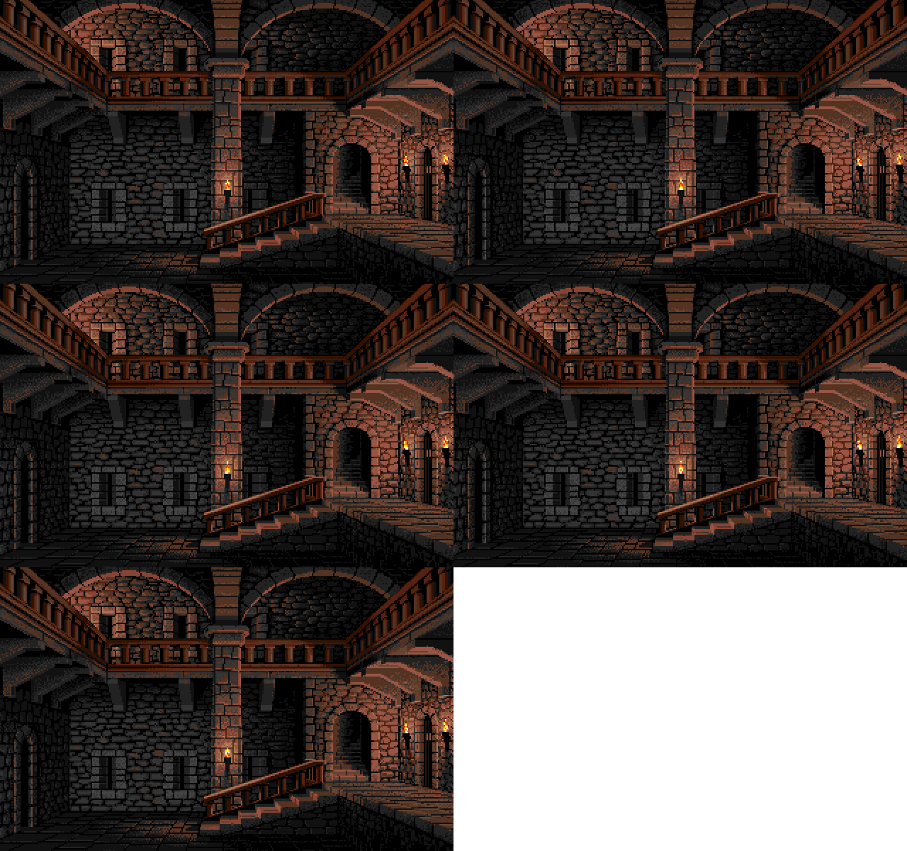
DefenderOfTheCrown2_CastleNormanHall
DefenderOfTheCrown_CastleNormanHall
  • Amiga
From Defender of the Crown 2
From Defender of the Crown

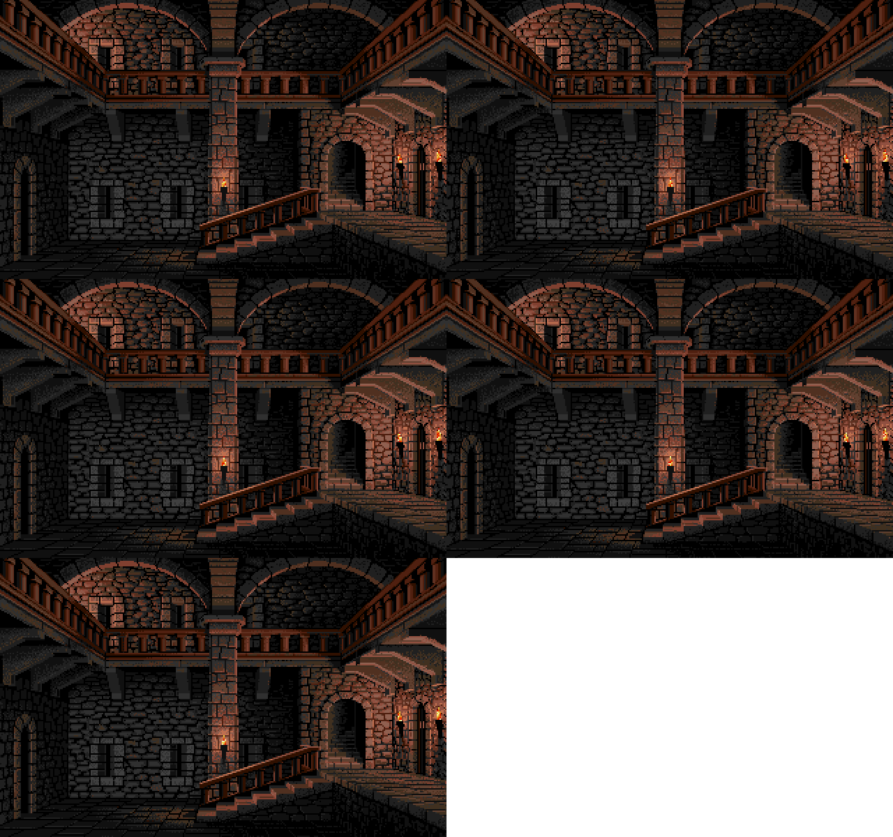
DefenderOfTheCrown2_CastleNormanYard
DefenderOfTheCrown_CastleNormanYard
  • Defender of the Crown 2
  • Amiga
  • From Defender of the Crown
  • Prequel

DefenderOfTheCrown2_CastleSaxon_day
DefenderOfTheCrown2_CastleSaxon_night
DefenderOfTheCrown_CastleSaxon_day
DefenderOfTheCrown_CastleSaxon_night
  • Defender of the Crown 2 - Day time palette
  • Amiga
DefenderOfTheCrown2_CastleSaxon_day
  • Defender of the Crown 2 - Night time palette
  • Variation
DefenderOfTheCrown2_CastleSaxon_night
  • Defender of the Crown - Day time palette
  • IFF
  • Prequel
DefenderOfTheCrown_CastleSaxon_day
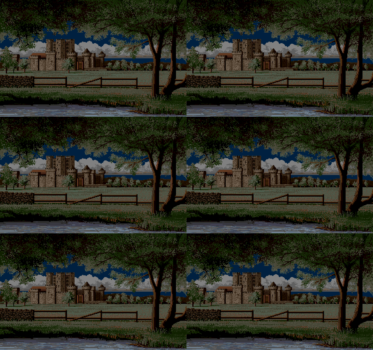
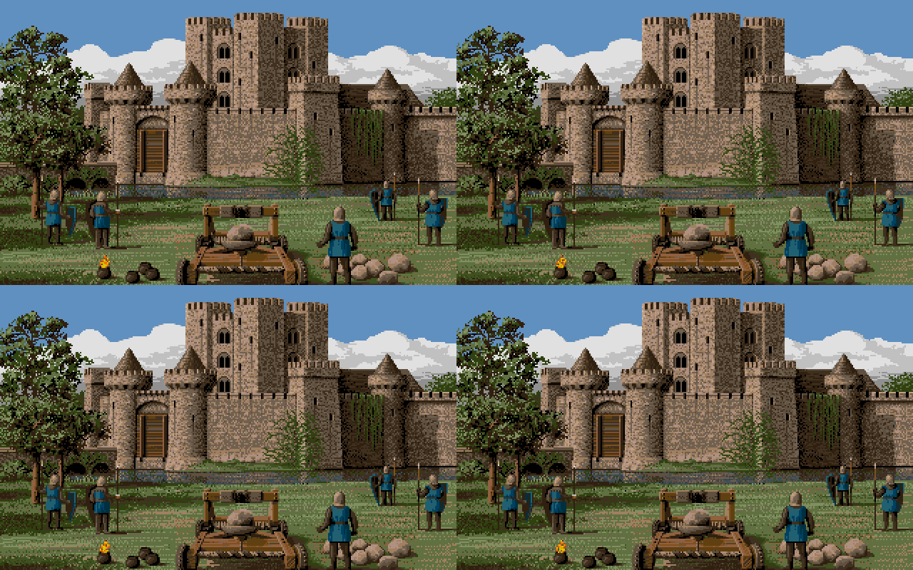
The castle pictures from Defender of the Crown used the same picture but with different color palettes for the day and night time versions.
  • Defender of the Crown - Night time palette
  • IFF
  • Prequel
DefenderOfTheCrown_CastleSaxon_night

DefenderOfTheCrown2_CastleSaxonCatapult
DefenderOfTheCrown_CastleSaxonCatapult
  • Defender of the Crown 2
  • Amiga
  • Defender of the Crown
  • IFF
  • Prequel
Printed in Jim Sachs Calendar 1991

The Siege April, 1986
Scene from Defender of the Crown
(Fire elements were eliminated from the final game)

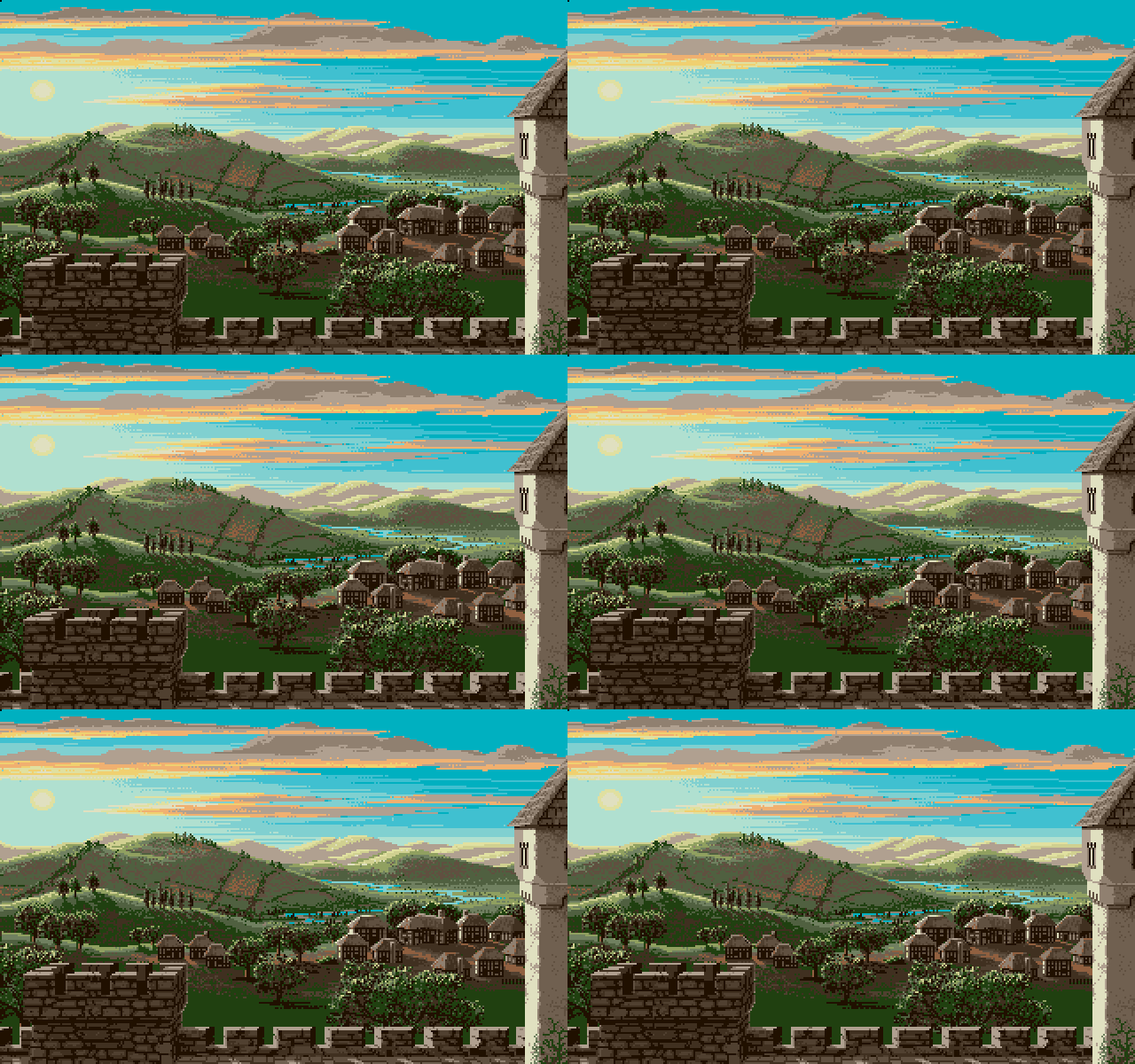
Color Intensity: The computer can display colors far more intense than those usually found in nature, so to achieve realism I try to set up the palette with mostly pastel shades. The sky is not nearly as blue, nor grass as green as most people imagine them.

DefenderOfTheCrown_Ending
DefenderOfTheCrown_Ending_bgr
  • Defender of the Crown
  • IFF
  • Amiga
  • Defender of the Crown - Background only
  • IFF
  • Variation

  • Defender of the Crown 2
  • Amiga
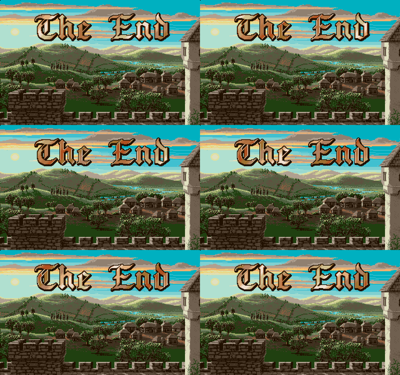
Jim posted a complete version of the Defender of the Crown 2 ending on his personal YouTube channel.

  • Amiga
DefenderOfTheCrown2_Finale_StainedGlass
From Defender of the Crown 2

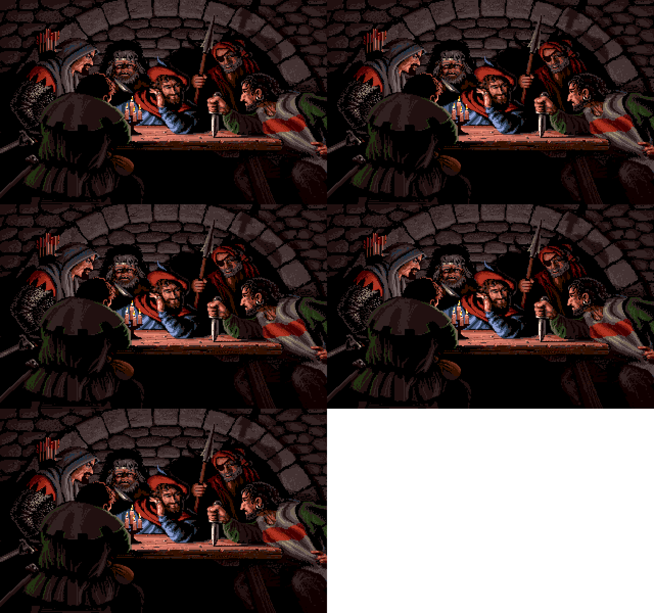
DefenderOfTheCrown2_Normans
DefenderOfTheCrown_Normans
  • Defender of the Crown 2
  • IFF
  • Amiga
  • Defender of the Crown
  • IFF
  • Prequel

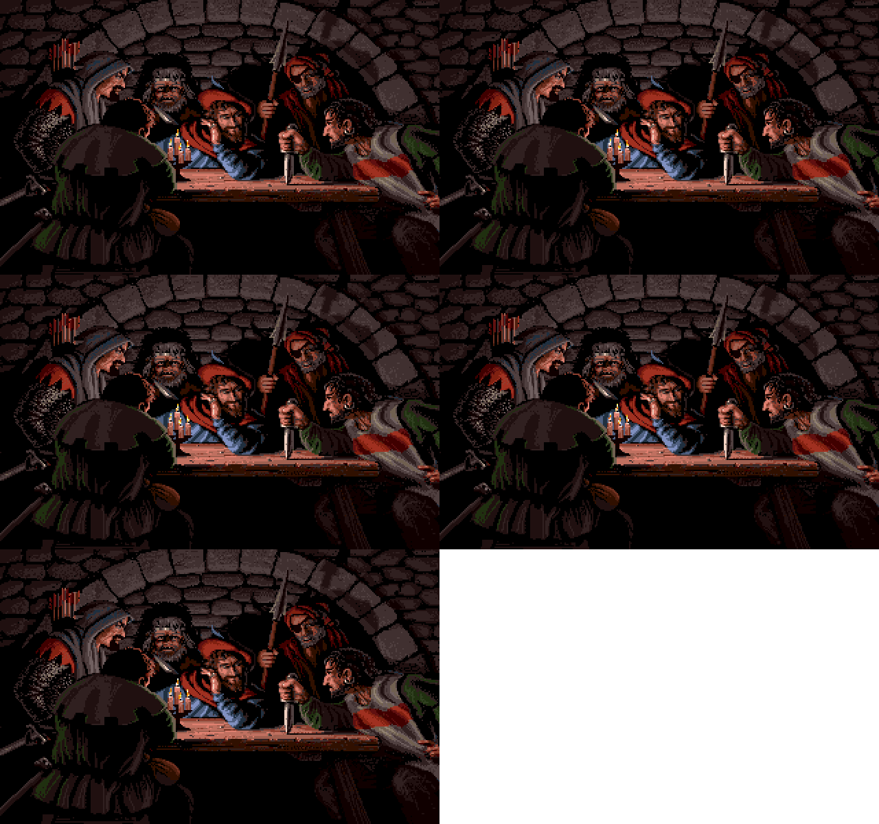
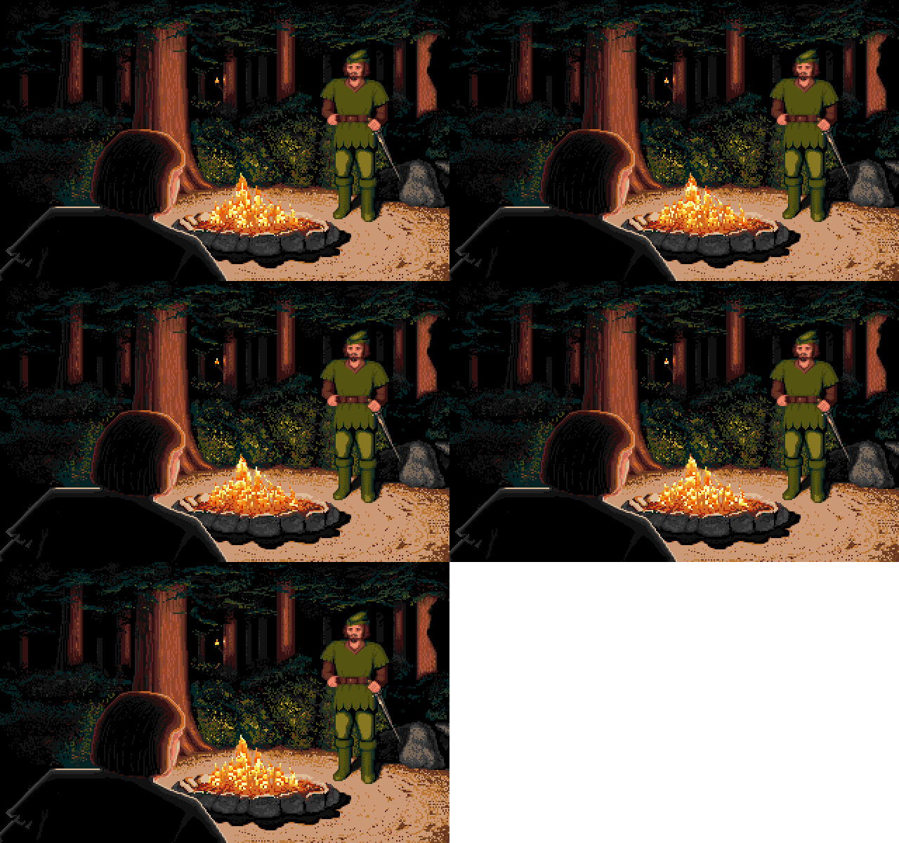
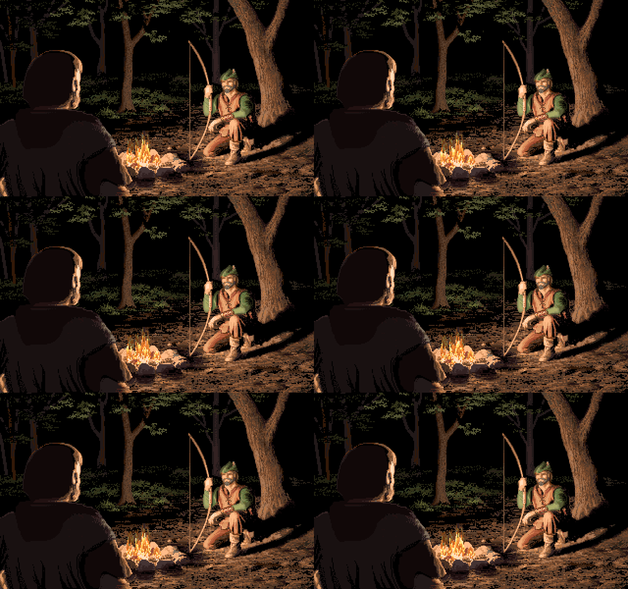
DefenderOfTheCrown2_RobinHood
DefenderOfTheCrown_RobinHood
  • Defender of the Crown 2
  • IFF
  • Amiga
  • Defender of the Crown
  • IFF
  • Prequel
This image was not drawn by Jim Sachs and he was not happy with it. He therefore created a completely new version for Defender of the Crown 2.

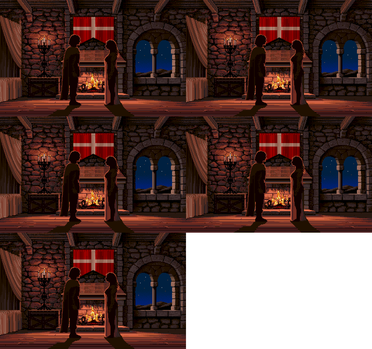
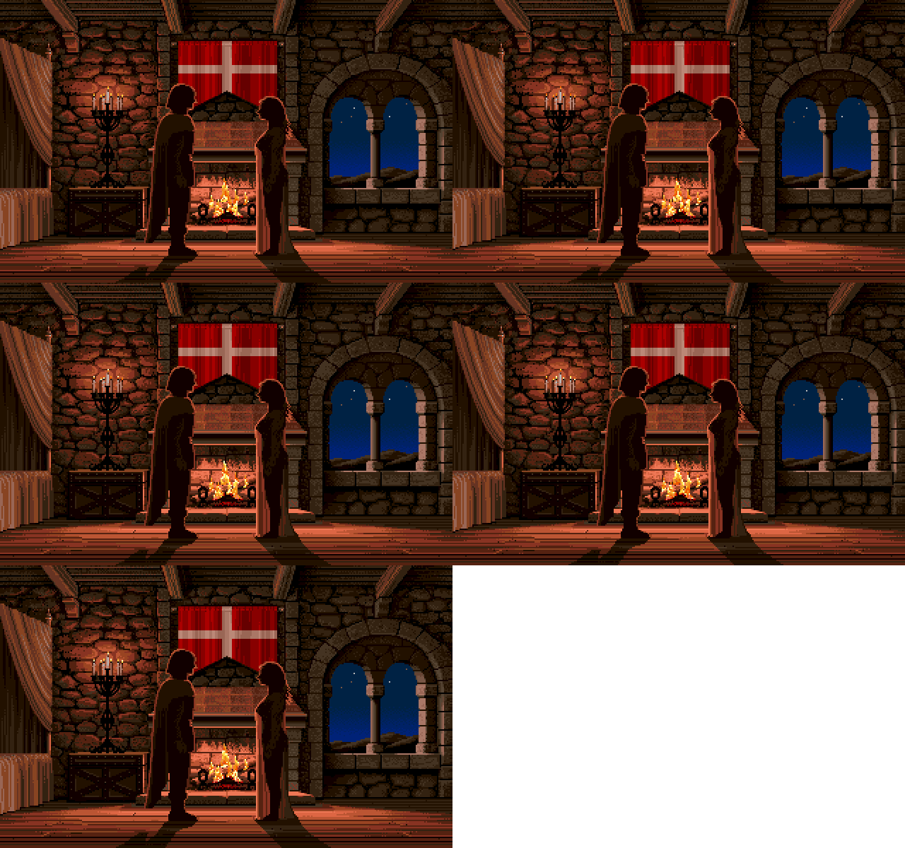
DefenderOfTheCrown2_Romantic_Fireplace
DefenderOfTheCrown_Romantic_Fireplace
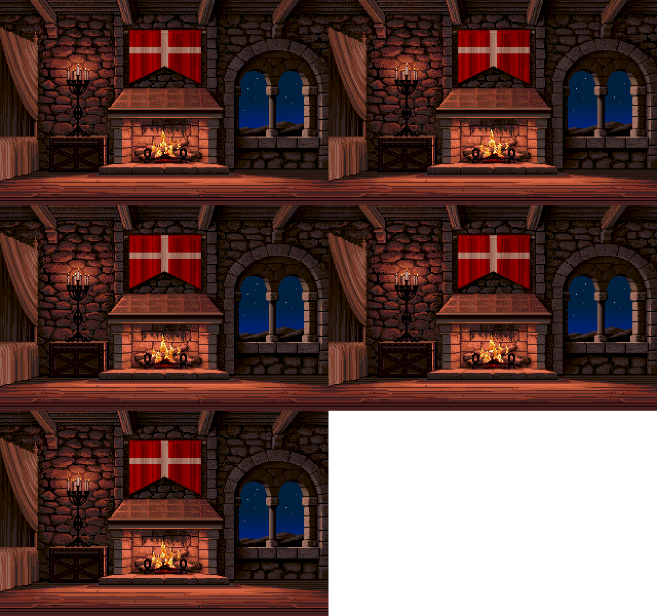
DefenderOfTheCrown_Romantic_Fireplace_bgr
  • Defender of the Crown 2
  • Amiga
  • Defender of the Crown
  • IFF
  • Prequel
  • Defender of the Crown - Background only
  • IFF
  • Prequel
Printed in Jim Sachs Calendar 1991

The Bedroom June, 1986
Scene from Defender of The Crown

Single-Point Perspective If you simply must use perspective in a scene, try single-point perspective. All lines that travel into the scene in the third dimension would aim towards a single vanishing point, somewhere near the center of the screen, but horizontal and vertical lines remain unchanged.

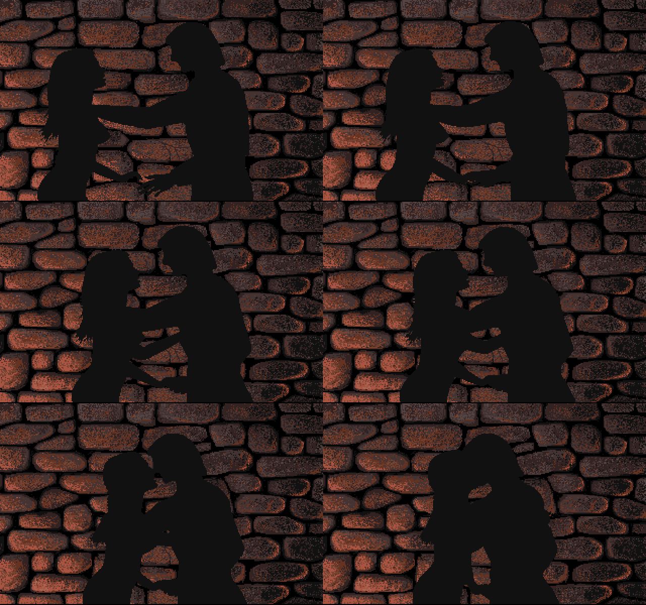
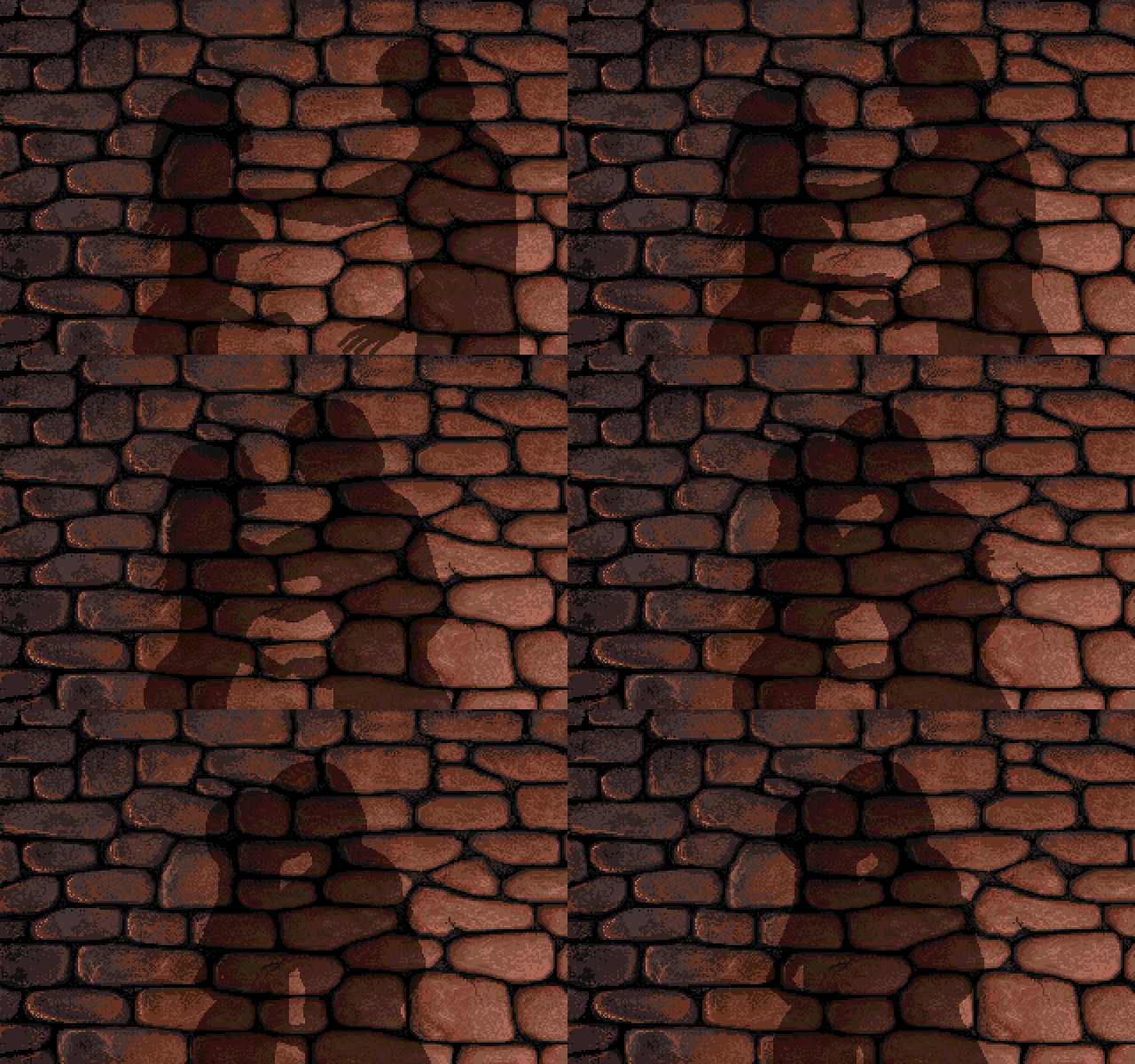
DefenderOfTheCrown2_Romantic_Kiss
DefenderOfTheCrown_Romantic_Kiss
  • Defender of the Crown 2
  • Amiga
  • Defender of the Crown
  • Prequel

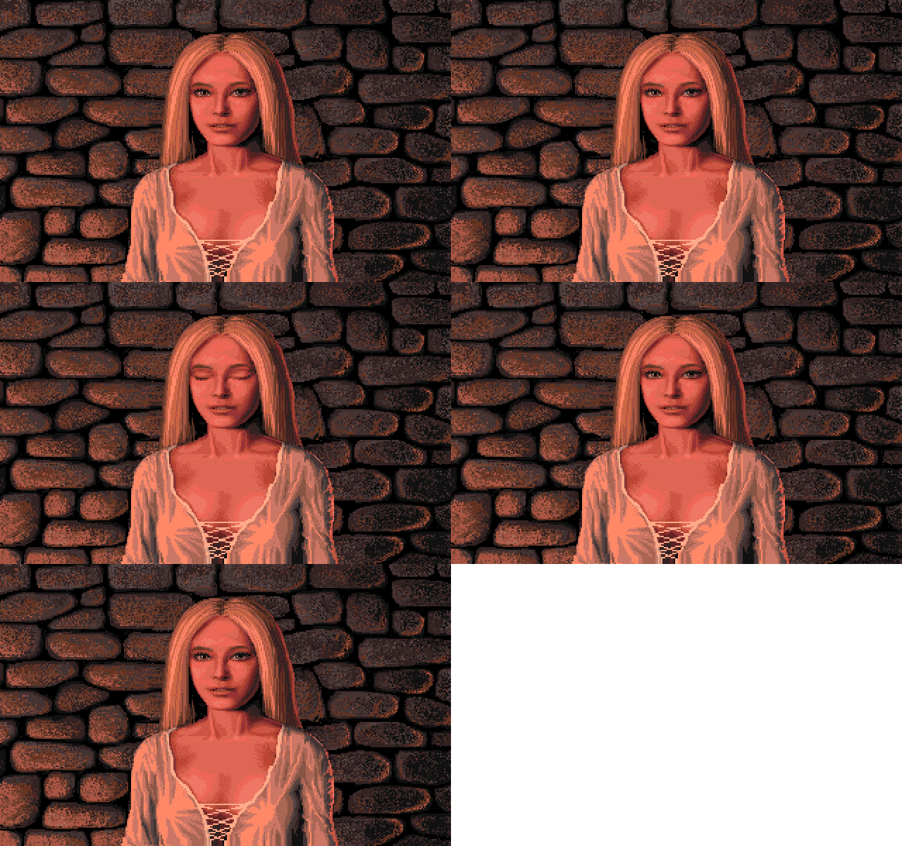
DefenderOfTheCrown2_Romantic_LadyAnne
DefenderOfTheCrown_Romantic_LadyAnne
  • Defender of the Crown 2
  • Amiga
  • Defender of the Crown
  • Prequel

DefenderOfTheCrown2_Romantic_LadyKatherine
DefenderOfTheCrown_Romantic_LadyKatherine
  • Defender of the Crown 2
  • Amiga
  • Defender of the Crown
  • IFF
  • Prequel
DefenderOfTheCrown_Romantic_LadyKatherine
Printed in Jim Sachs Calendar 1991

Katherine May, 1986
Scene from Defender of The Crown

Faces When analyzed as patterns of light and shadow, the human face becomes no harder to draw than any other object. However, it is important to view your work with "fresh eyes" quite often. On the computer, this is as easy as capturing the image as a brush, then flipping it over. If the reversed image still looks normal to you, then it's probably pretty accurate.

  • Defender of the Crown
  • Amiga
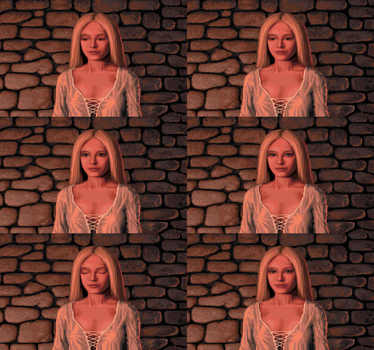
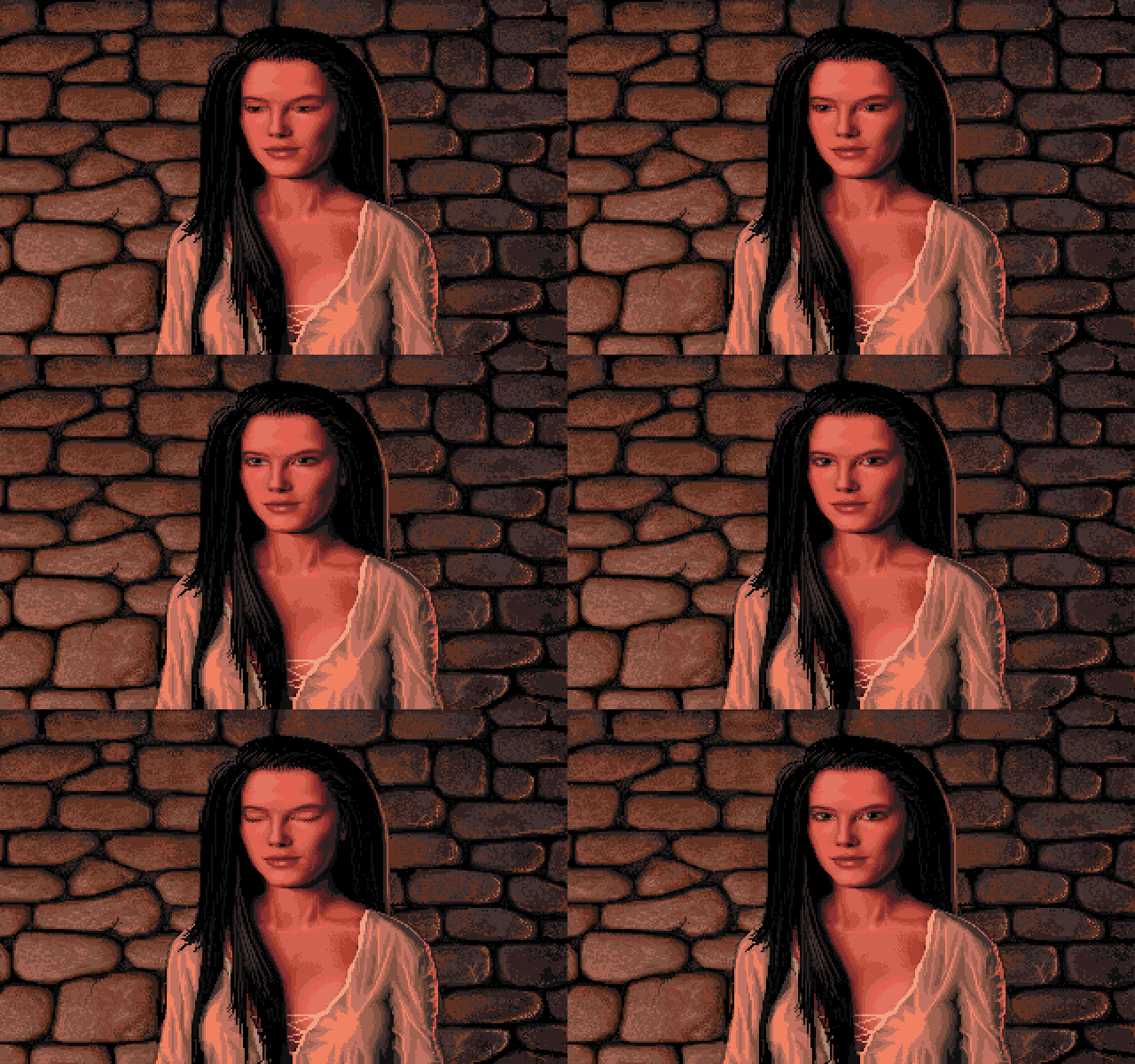
Interestingly two of the four maidens were left out for Defender of the Crown 2, with Lady Rebecca being one of them.

  • Defender of the Crown
  • Amiga
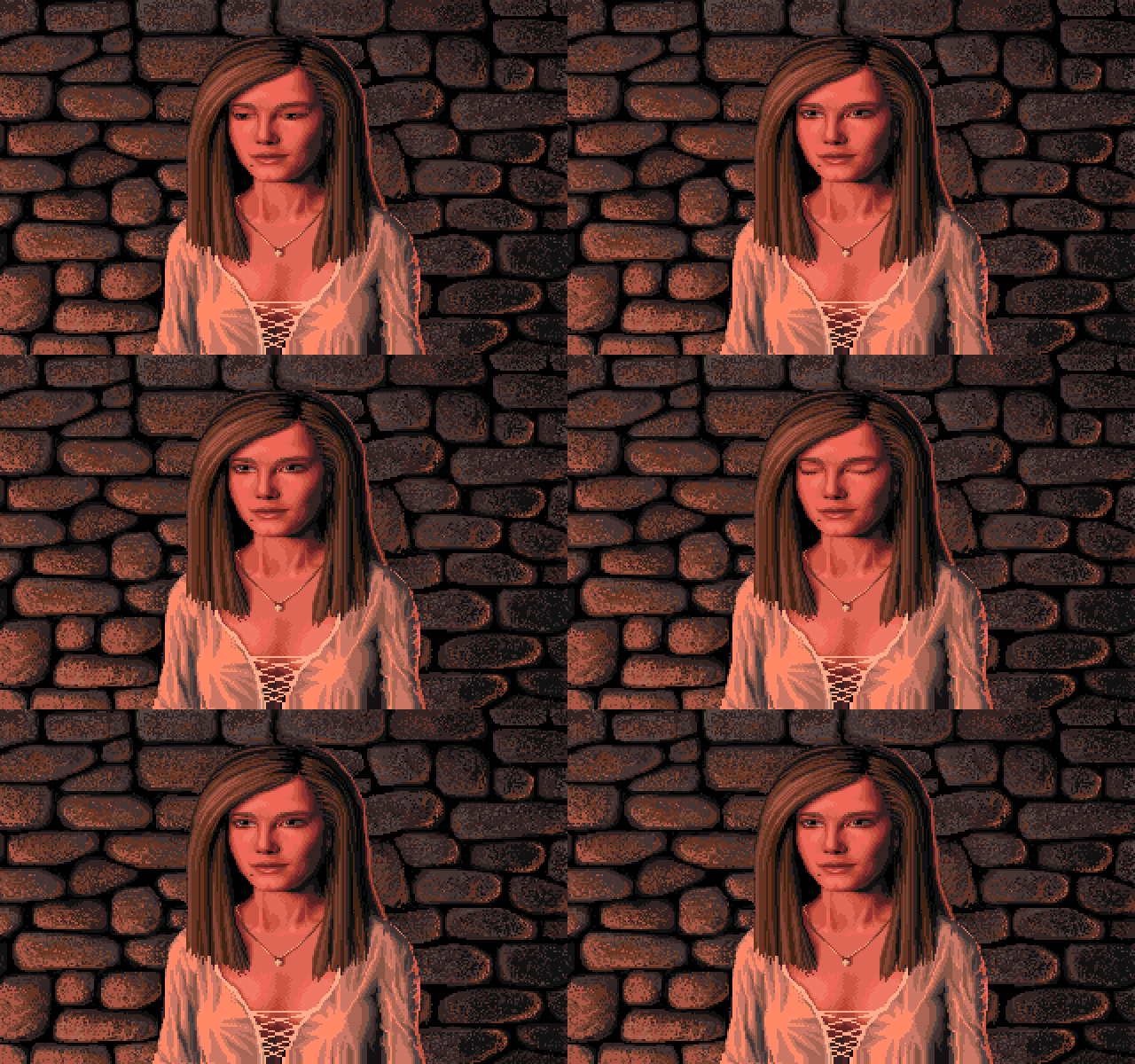
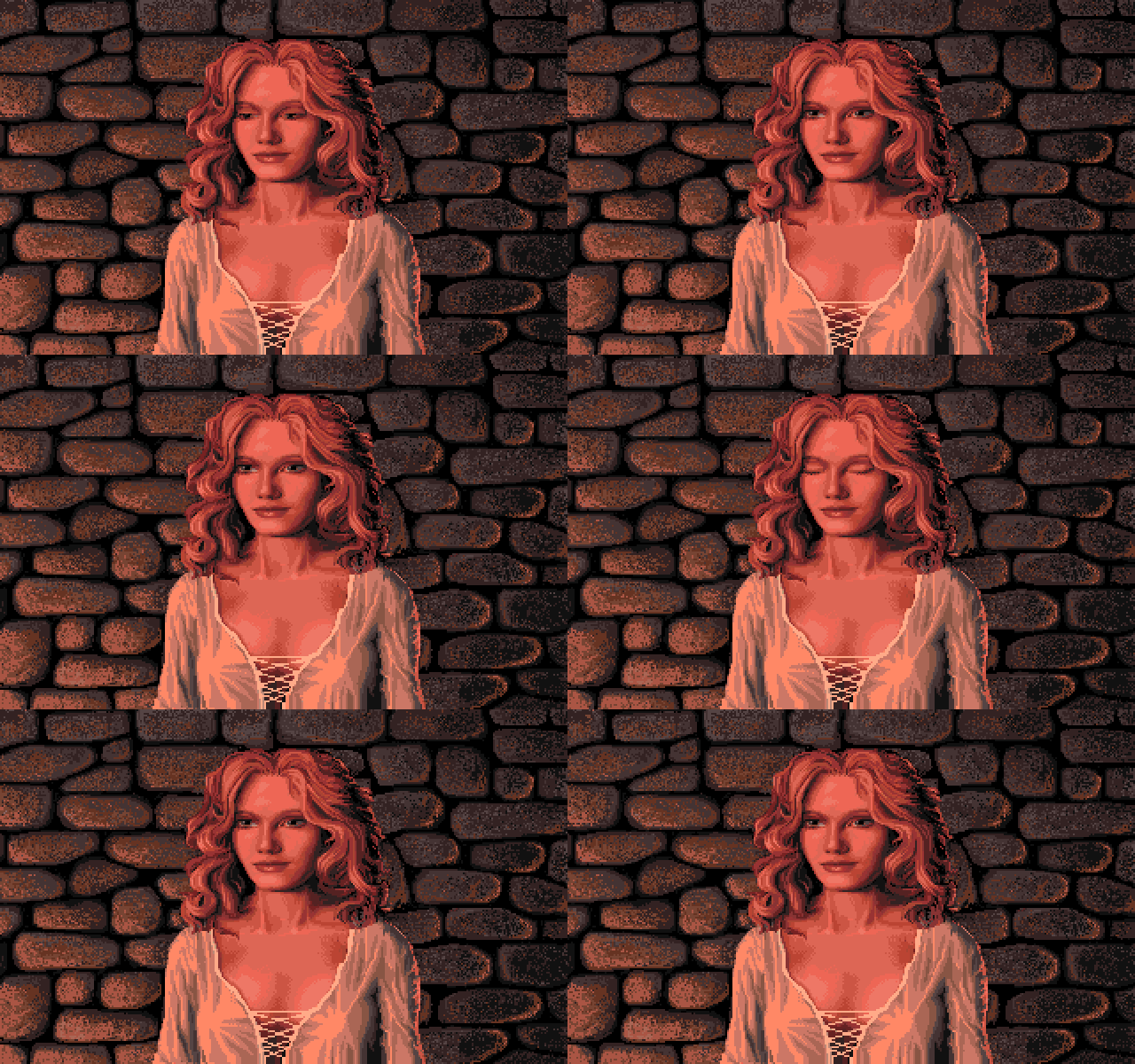
Interestingly two of the four maidens were left out of Defender of the Crown 2, with Lady Rosalind being one of them.

  • Defender of the Crown 2
  • Amiga

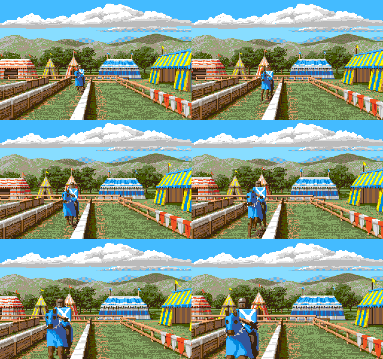
DefenderOfTheCrown2_Tournament_Begin
DefenderOfTheCrown_Tournament_Begin
  • Defender of the Crown 2
  • Amiga
DefenderOfTheCrown2_Tournament_Begin
  • Defender of the Crown
  • Prequel
DefenderOfTheCrown_Tournament_Begin

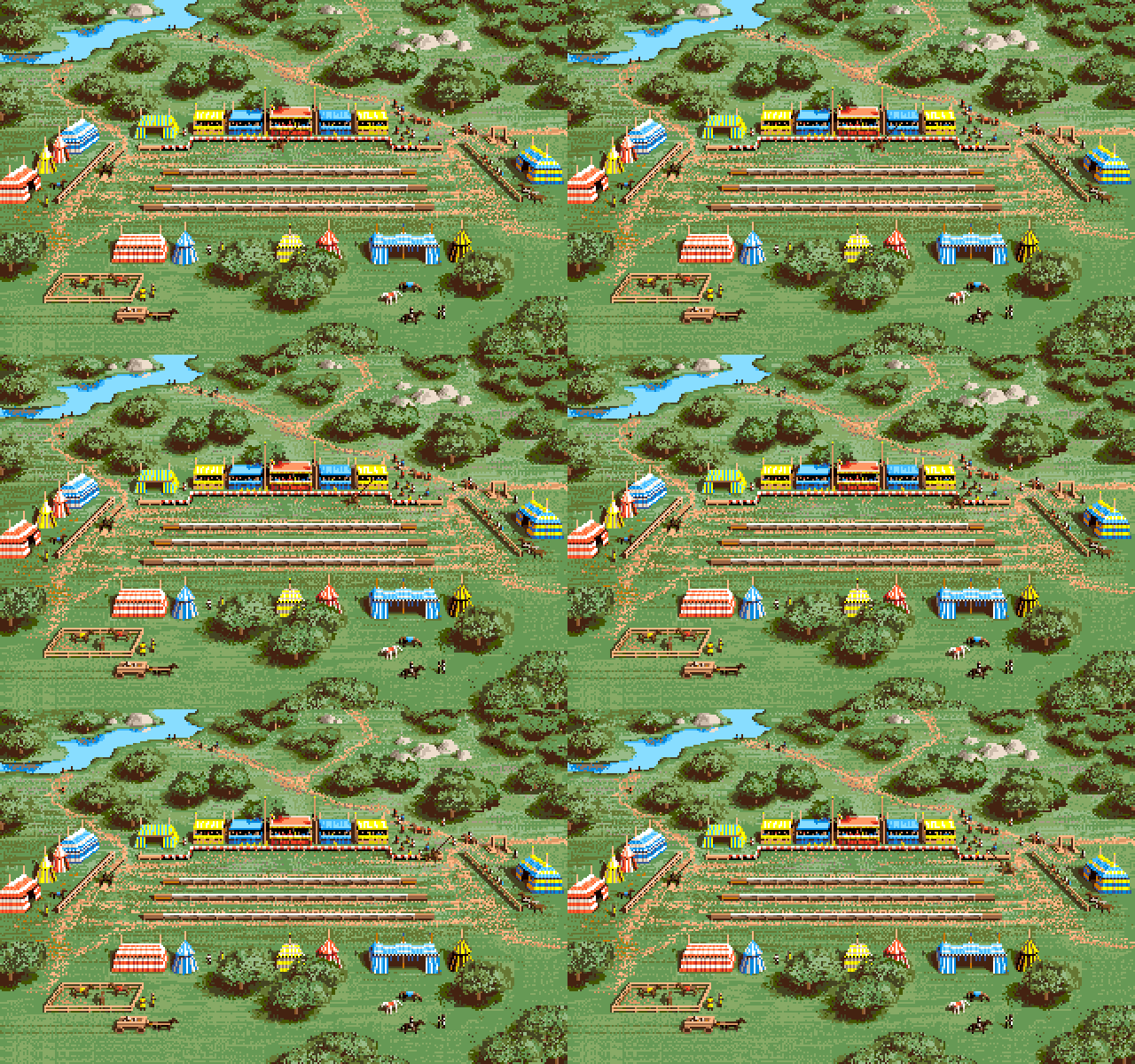
DefenderOfTheCrown2_Tournament_BirdsEyeView
DefenderOfTheCrown_Tournament_BirdsEyeView
  • Defender of the Crown 2
  • Amiga
DefenderOfTheCrown2_Tournament_BirdsEyeView
  • Defender of the Crown
  • Prequel

DefenderOfTheCrown2_Tournament_Fanfare
DefenderOfTheCrown_Tournament_Fanfare
  • Defender of the Crown 2
  • Amiga
DefenderOfTheCrown2_Tournament_Fanfare
  • Defender of the Crown
  • IFF
  • Prequel
DefenderOfTheCrown_Tournament_Fanfare

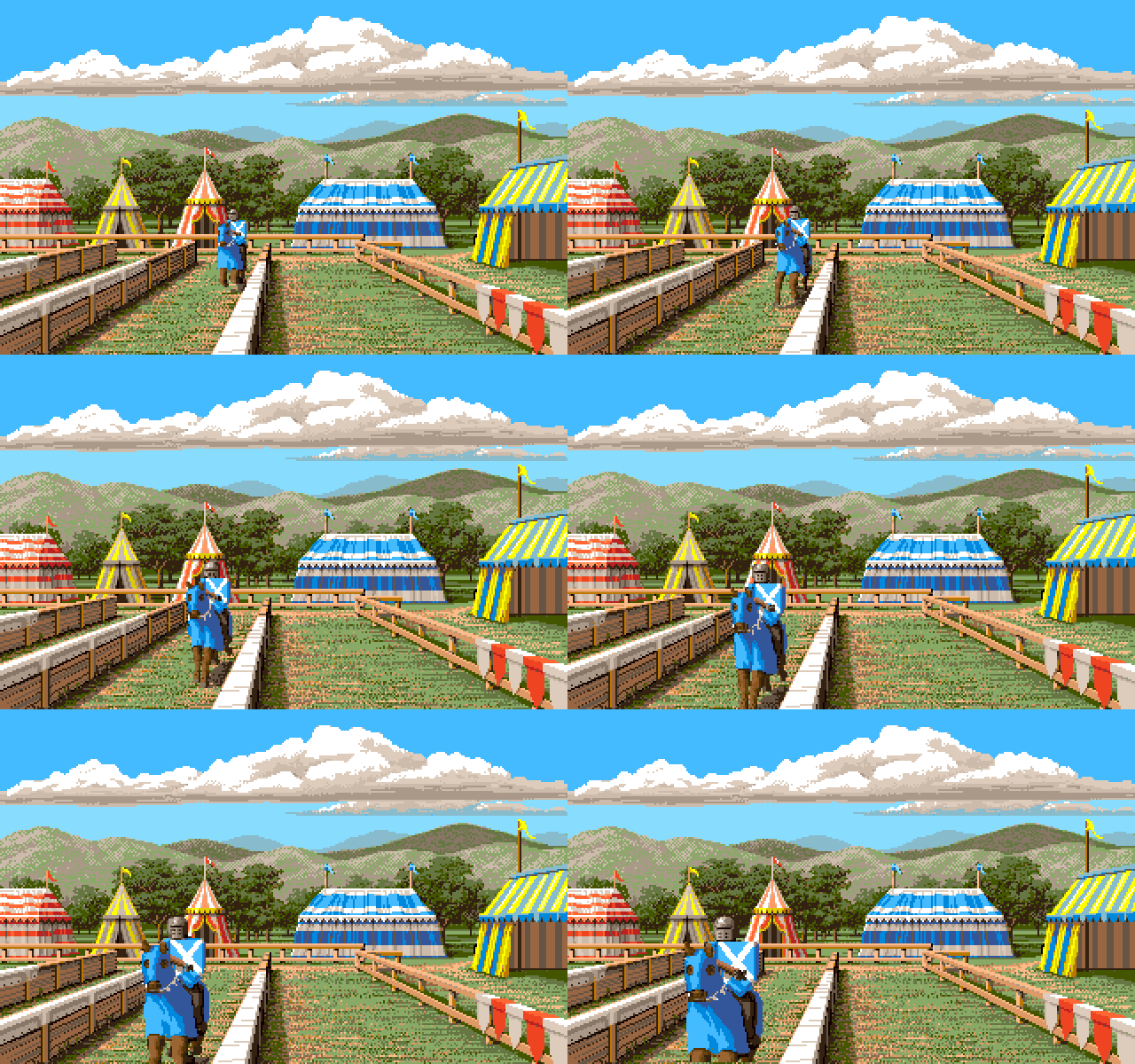
DefenderOfTheCrown2_Tournament_OnComing
DefenderOfTheCrown_Tournament_OnComing
  • Defender of the Crown 2
  • Amiga
  • Defender of the Crown
  • Prequel

  • Amiga
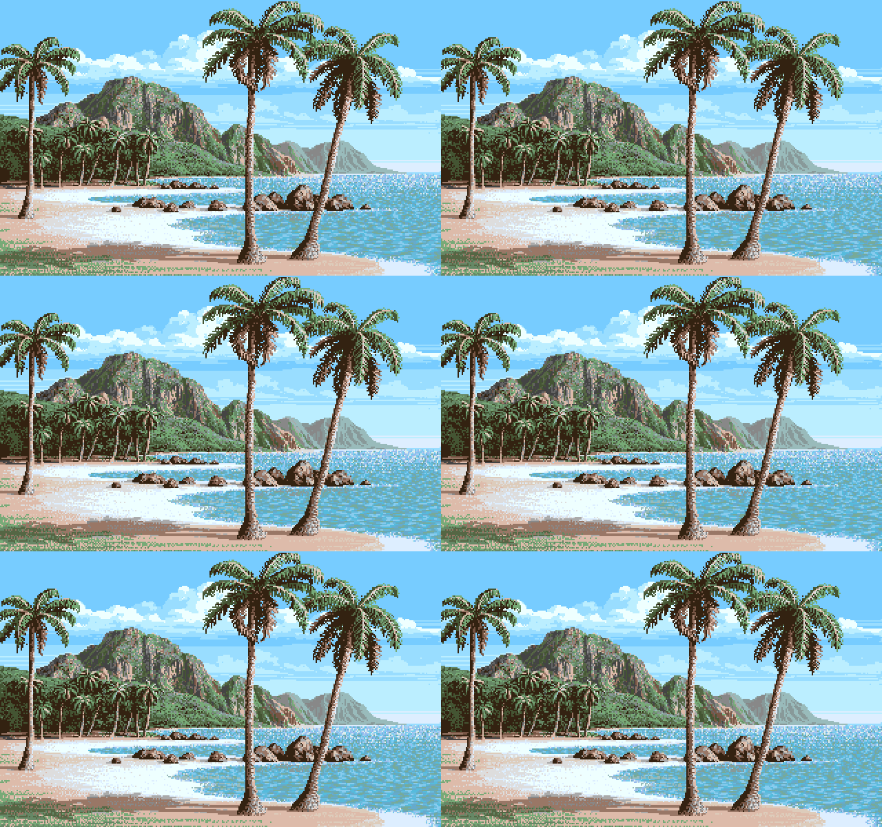
Printed in Jim Sachs Calendar 1991

The Island March, 1989
Scene from 20,000 Leagues Under The Sea

Distance Even on the clearest of days, air is not completely transparent - it's blue. The further away an object is, the more air to give it a bluish cast and rob it of its contrast.

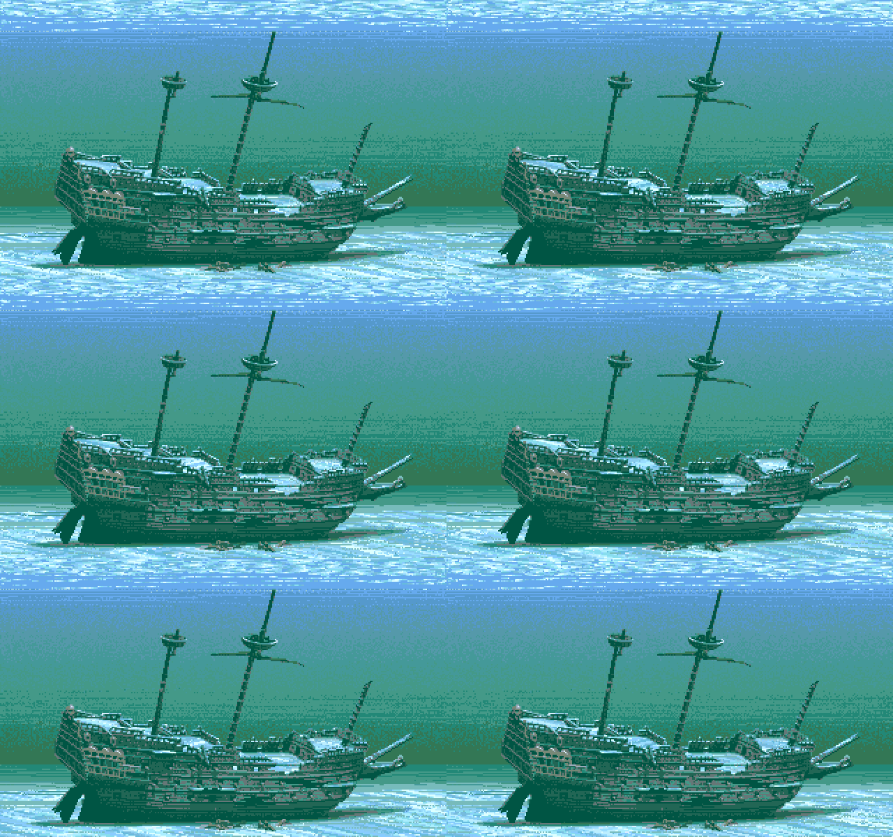
JimSachs_20000LeaguesUnderTheSea_Shipwreck
JimSachs_20000LeaguesUnderTheSea_Shipwreck_var
  • Amiga
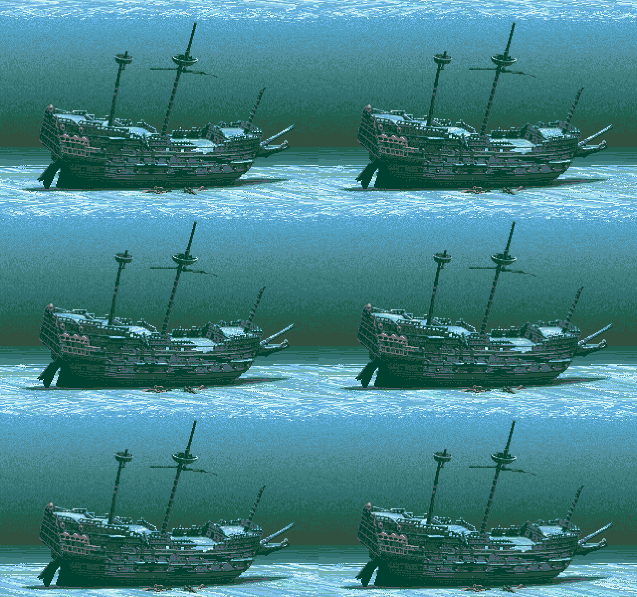
Printed in Jim Sachs Calendar 1991

Shipwreck May, 1987
Scene from 20,000 Leagues Under The Sea

Low Contrast An underwater scene is one of the few instances where I use low contrast - the darks are not very dark. Other instances would include fog effects and objects at great distance.

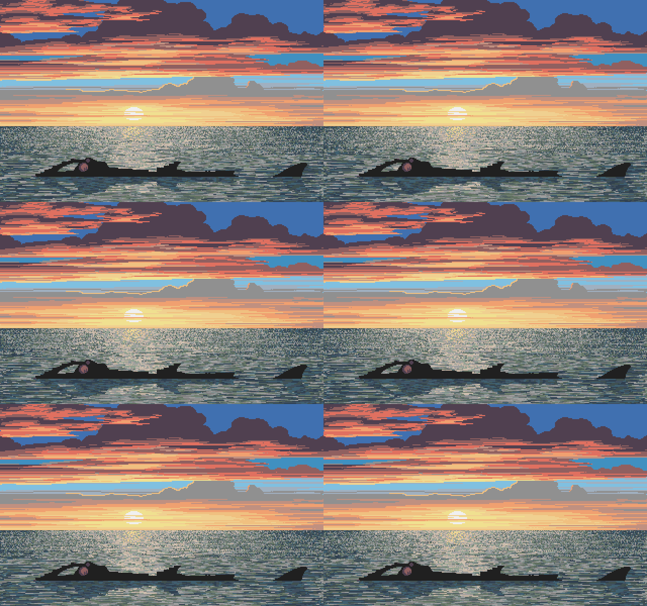
This image belonged to a sequence where the Nautilus can be seen sinking slowly in the sunset. Jim captured this sequence from a VHS recording that he had made from the game demo during development and posted it on his personal YouTube channel.


JimSachs_Aegis

JimSachs_AmigaDemo1
JimSachs_AmigaDemo1_var
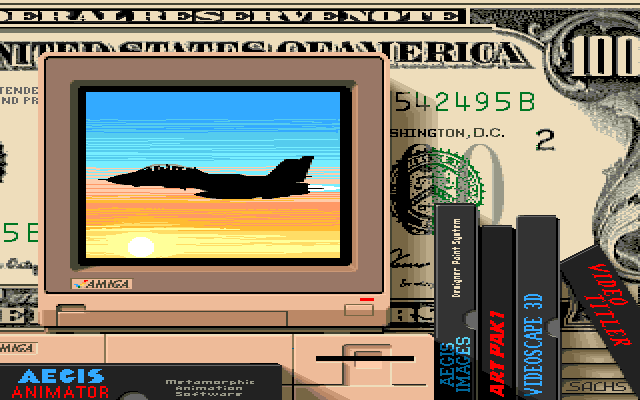
Used in the "Amiga Dealer" demo. It was produced by Commodore to promote Amigas that were on display in shops. This image was shown in the "Amiga Features" part.

Printed in Amiga Format September 1989 - Page 65 and Jim Sachs Calendar 1991

MultiMedia Original February, 1987; Updated June, 1990
Cover for Amiga World Special Issue & Amiga advertisement

Layering A sense of depth can be created without the use of perspective by building up several layers of objects. The light source and shadows are very important for this illusion.

JimSachs_AmigaDemo2
JimSachs_AmigaDemo2_var
JimSachs_AmigaDemo2
JimSachs_AmigaDemo2_var
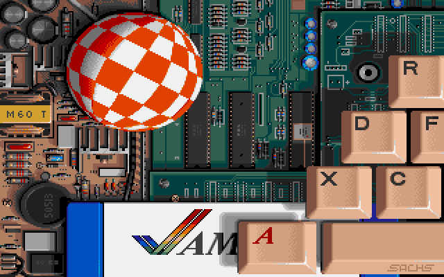
Used in the "Amiga Dealer" demo. It was produced by Commodore to promote Amigas that were on display in shops.
This image was shown in the "Art & Graphics" part.

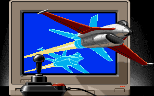
JimSachs_AmigaDemo3
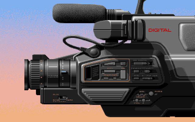
Used in the "Amiga Dealer" demo. It was produced by Commodore to promote Amigas that were on display in shops.
This image was shown in the "Video" part.

Printed in Jim Sachs Calendar 1991 as well.

The VideoCamera August, 1989
Screen from Amiga 500 Demo

Layout A great deal of time can be saved if an object to be drawn is laid out so that most of its lines are horizontal and vertical, following the natural axis of the screen. Because of all the smoothing of diagonal lines that would be necessary with perspective or angled views, a straight side, front or top view will usually yield a crisper image.

JimSachs_AmigaDemo4
JimSachs_AmigaDemo4_var
JimSachs_AmigaDemo4
Used in AmigaVision tutorial (1990)
  • Variation
JimSachs_AmigaDemo4_var
Use in Amiga demo
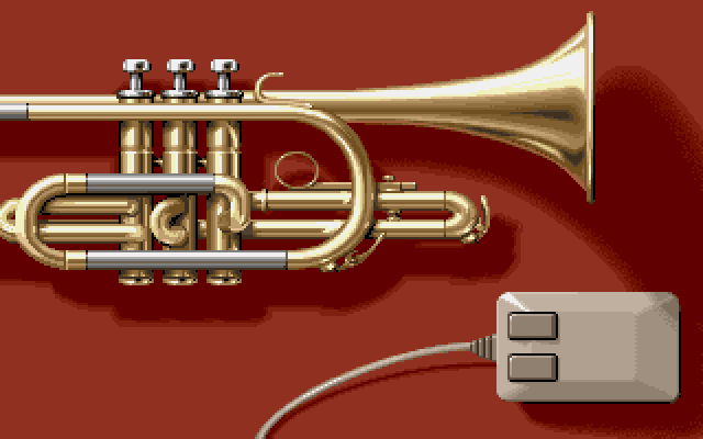
Used in the "Amiga Dealer" demo. It was produced by Commodore to promote Amigas that were on display in shops.
This image was shown in the "Music" part.

Printed in Jim Sachs Calendar 1991 as well.

The Siege August, 1989
Screen from Amiga 500 Demo

Light Source The direction of light needs careful planning in every picture. A sense of depth and realism can only be achieved when all shadows and highlights are consistent. Pay especially close attention to the light sources on objects imported from other scenes.

JimSachs_AmigaDemo5
Used in the "Amiga Dealer" demo. It was produced by Commodore to promote Amigas that were on display in shops.
This image was shown in the "Entertainment" part.

Printed in Jim Sachs Calendar 1991 as well.

Games August, 1989
Screen from Amiga 500 Demo

Anti-Aliasing In lower resolutions, diagonal lines drawn on a computer screen have a pronounced "stair-step" quality known as aliasing. By manually blending these jagged lines into the surrounding colors, we can eliminate much of this problem.

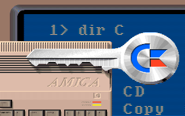
JimSachs_AmigaDemo7
JimSachs_AmigaDemo7_amigados
JimSachs_AmigaDemo7
The version was used in Commodore's "Amiga Dealer" demo.
JimSachs_AmigaDemo7_amigados
The version used in Rob Peck's "Amiga Companion" book.
Used in the "Amiga Dealer" demo. It was produced by Commodore to promote Amigas that were on display in shops.
This image was shown in the "Education" part.

Interestingly there was also a version of this image that was used for the "Amiga Companion" book by Rob Peck. The biggest difference between the two was the peacock on the key, that was replaced by the Amiga rainbow check logo.

The Amiga Companion version is lowres-interlaced, which leads me to think that it was created first and the Amiga Demo version was downscaled to fit with the other images.


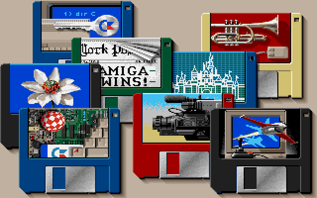
JimSachs_AmigaDemo8
Used in the "Amiga Dealer" demo. It was produced by Commodore to promote Amigas that were on display in shops.
This image was shown in the "Products" part.

JimSachs_AmigaLagoon

  • Amiga
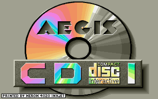
JimSachs_CDI

  • Amiga
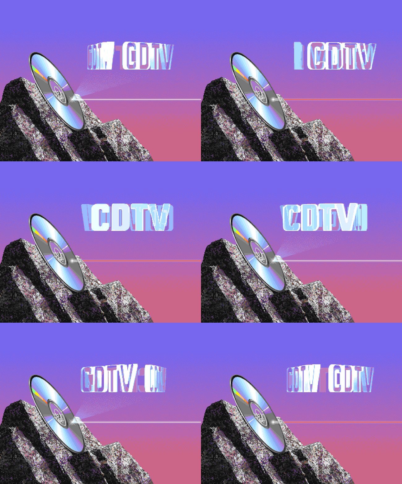
This is the official boot screen from Commodore's CDTV Amiga. It differs a bit from the Anim version that is circulating the web, possibly because of size constraints within the boot roms.
It doesn't work that well as gif animation as most browsers don't play it back at the correct speed.


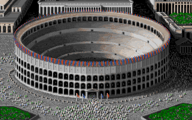
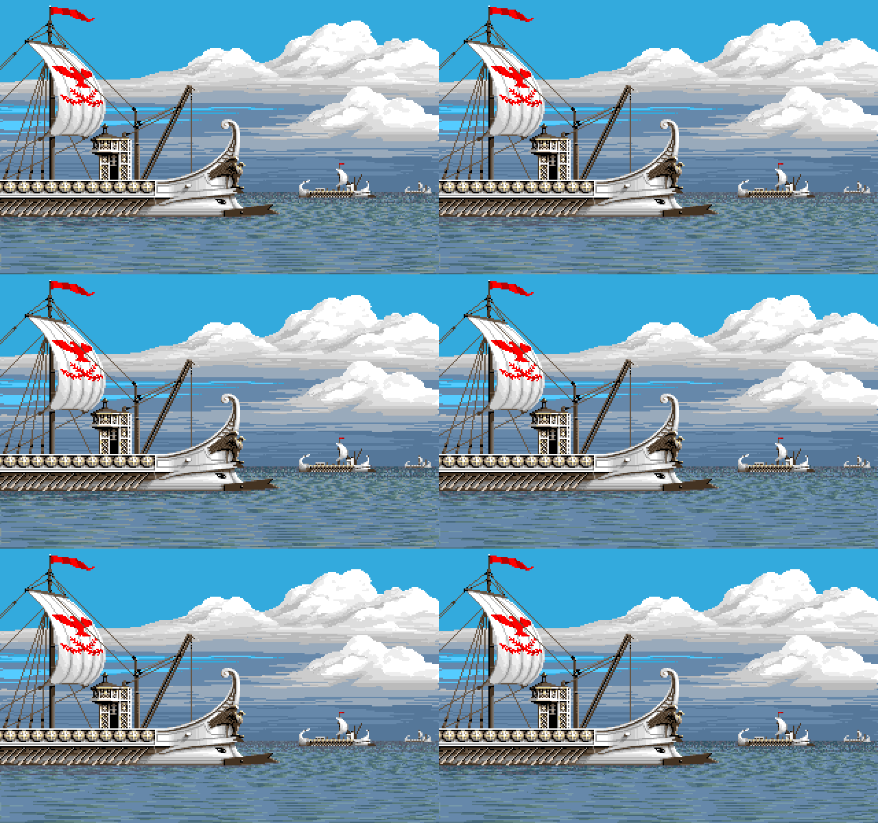
JimSachs_Centurion_Colloseum

Printed in Jim Sachs Calendar 1991

The Galleys August, 1988
Scene from Centurian

Resizing A sense of depth may also be created without the use of perspective by having different sizes of the same objects on the screen. Always draw the largest object first, capture it as a brush, resize it to a smaller size, then stamp. Be careful to line up the smaller images on the same plane as the original!

JimSachs_Commodore2
JimSachs_Commodore2_var
JimSachs_Commodore2
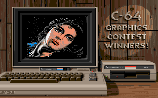
Commodore C64, 1702 Monitor, 1541 Floppy Drive
  • Variation
JimSachs_Commodore2_var
Commodore C64C, 1802 Monitor, 1541C Floppy Drive
Showing a rendition of Wayne Schmidt's 1987 C64 artwork called "Serene".


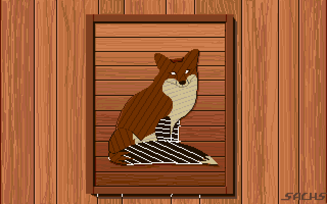
JimSachs_FoxPuppy

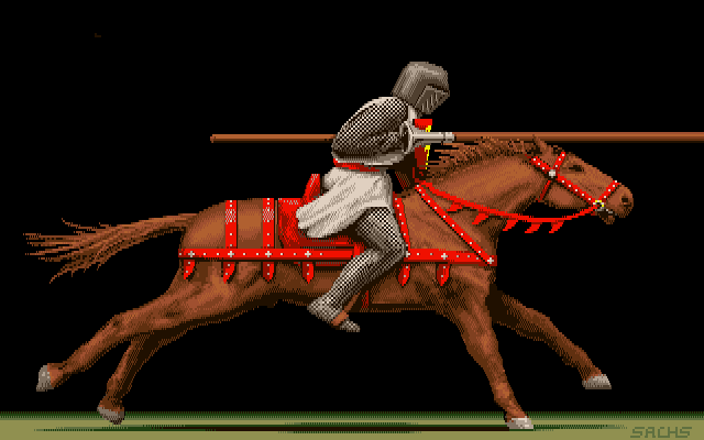
JimSachs_Knight

JimSachs_Knight2

JimSachs_MazdaRX7

  • Jim Sachs
  • Lowres Interlaced (NTSC)
  • 64 colors (44 used)
  • Amiga
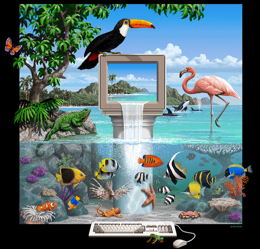
JimSachs_Multimedia
I couldn't find an original version of this file, but I had one that had scaling artifacts, because someone thought it was a good idea to scale this image down from 704x480 to 640x480.

I painstakingly fixed the columns that had interpolation in them to end up with this fairly faithful version of the image. The palette should be fairly accurate, but the order could be completely wrong. It is safe to assume that it was created in Extra Half Bright mode.

It looks like the original image had color cycling for the air bubbles, but sadly there was not enough information left to recover the effect.

JimSachs_Ninja900
JimSachs_Ninja900_var
JimSachs_Ninja900_var2
  • Variation
JimSachs_Ninja900_var2
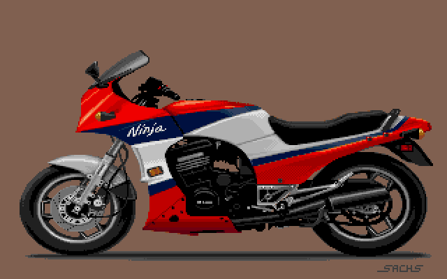
The variation with rider is a little strange, since the motorcycle seems to be slightly color reduced, despite the rider himself not really needing/using any additional colors. I currently can't say if Jim did this variation himself or for what this version was used for.
Printed in Jim Sachs Calendar 1991

The Kawasaki May, 1986
Promotional screen for Images paint program

High Contrast Very bright white and dark placks are usually necessary for a computer image to stand out as an attention-getter, especially when viewed on a monitor in a brightly lit room.

JimSachs_Office3D
JimSachs_Office3D_var
  • Amiga
  • Variation
JimSachs_Office3D_var
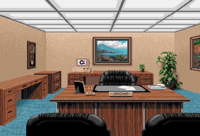
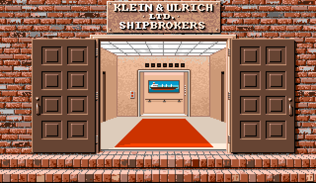
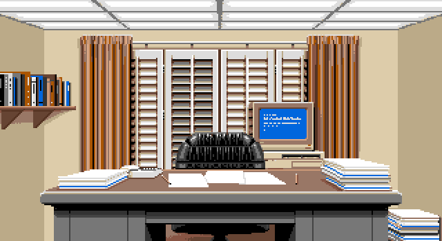
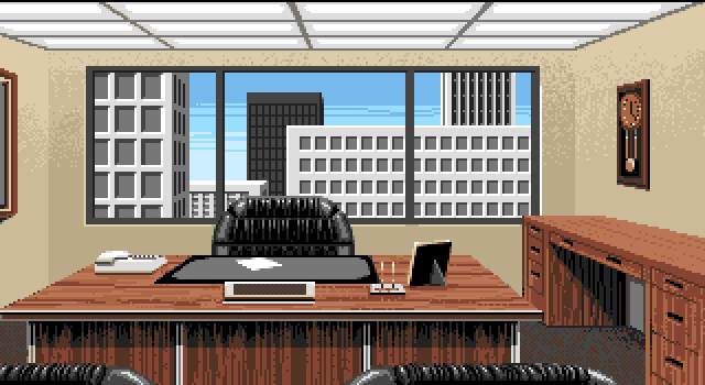
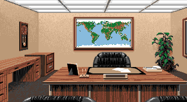
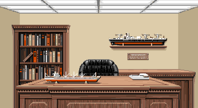
This is an office scene that was included in Ports of Call. It matches the Office 3D image closely, but uses fewer colors an has less details.
This image looks like an extended version of an image used in the game Ports of Call.

Most notable changes are the larger screen area and the increase in colors used.

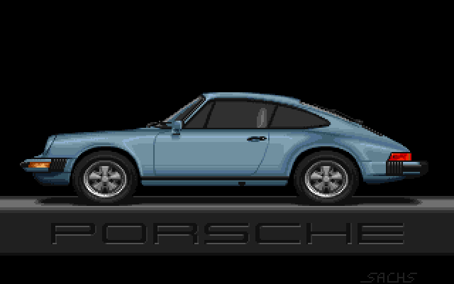
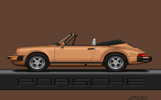
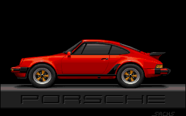
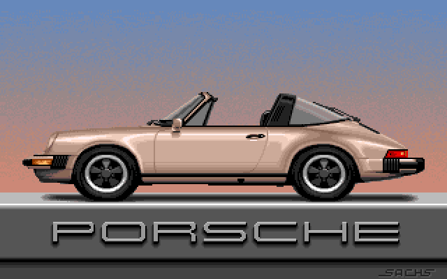
JimSachs_Porsche1

JimSachs_Porsche2

JimSachs_Porsche3

  • Amiga
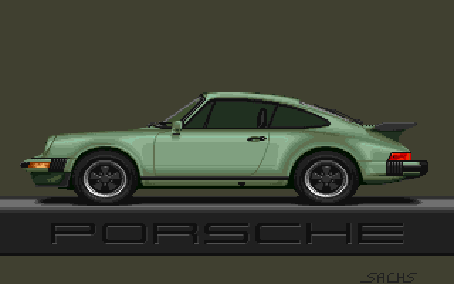
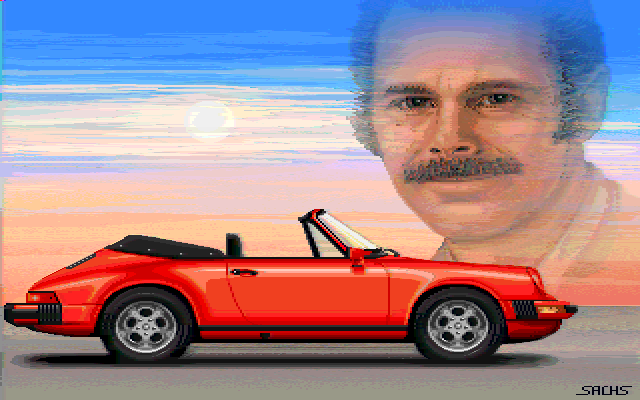
Printed in Jim Sachs Calendar 1991

The Porsche Original January, 1986; Updated August, 1989
Screen done for Painting With Light video.

Smooth Backgrounds If you want a very smooth wash of colors without any obvious pixels, try setting a range of five or six colors where the red and blue components change slightly from one color to the next, but the green does not vary. Not all desired color ranges can be accomplished this way, but it works well for sky and underwater effects.

JimSachs_Porsche5

JimSachs_PorscheRed5

JimSachs_PortsOfCall
JimSachs_PortsOfCall_var
  • Amiga
  • Variation
JimSachs_PortsOfCall_var
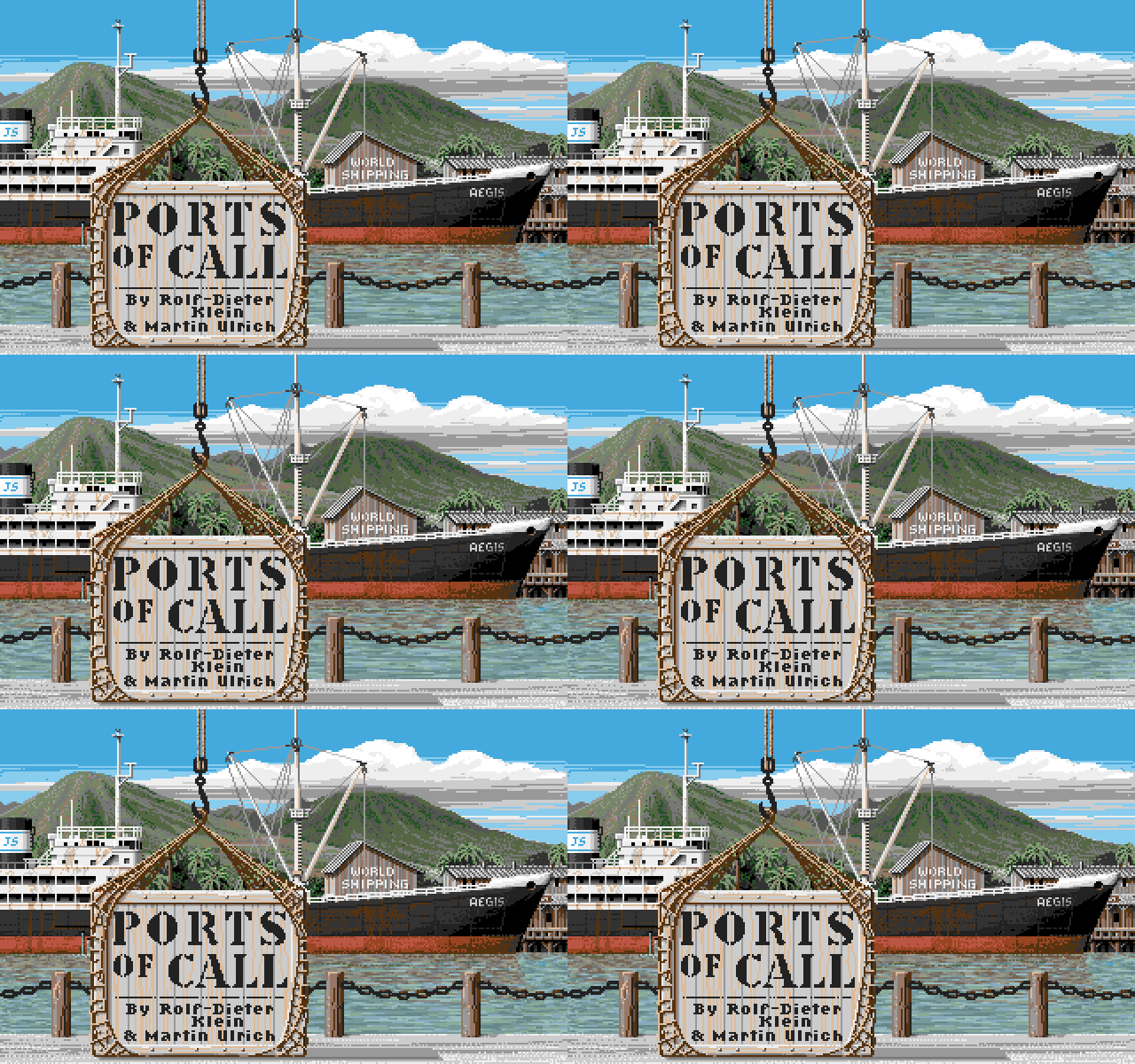
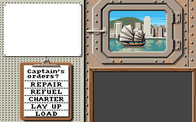
Jim re-used the title picture for Ports of Call in his abandoned [link=/game/20000LeaguesUnderTheSea.html]20.000 Leagues under the Sea[/link] project.

The german magazine Amiga Magazin did an article on Jim Sachs in their August 1989 issue. They previewed a screen from the project, while it was still in development, and you can clearly see the same sky, mountains and buildings.
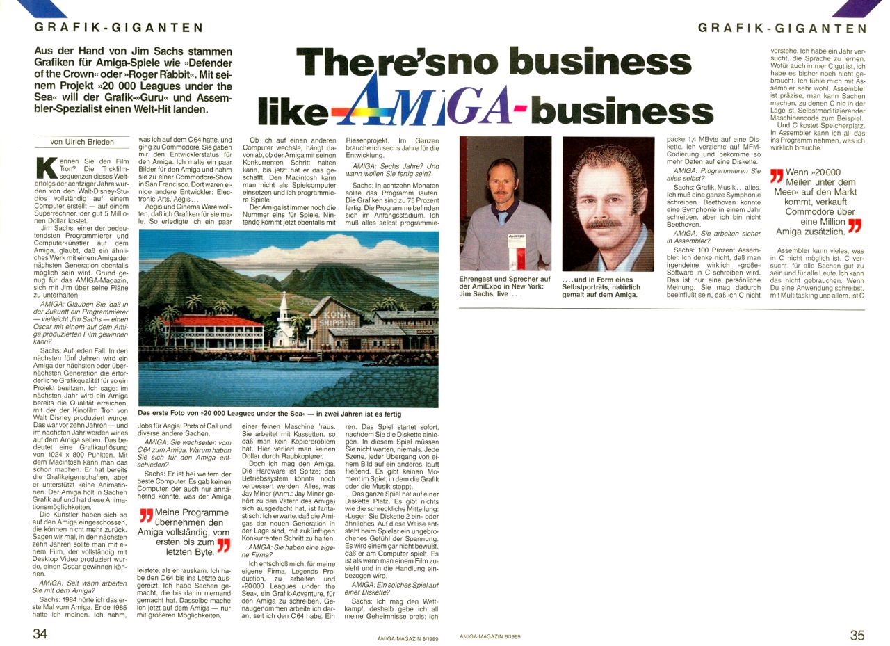
$2

  • Amiga
JimSachs_PortsOfCall_Broker

  • Amiga
JimSachs_PortsOfCall_Cabin

  • Amiga
JimSachs_PortsOfCall_Cities

  • Amiga
JimSachs_PortsOfCall_Office1

  • Amiga
JimSachs_PortsOfCall_Office2

  • Amiga
JimSachs_PortsOfCall_Office3

  • Amiga
JimSachs_PortsOfCall_Office4

  • Amiga
JimSachs_PortsOfCall_Rats

  • Amiga

JimSachs_RogerRabbit
JimSachs_RogerRabbit_wip
JimSachs_RogerRabbit
  • WIP
JimSachs_RogerRabbit_wip
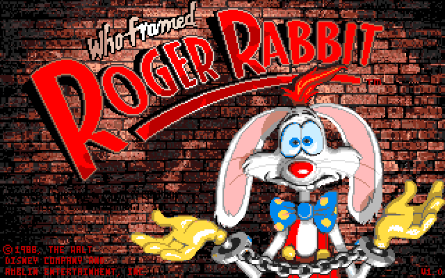
The work in progress is interesting as it shows several changes to the final image from the game.
Roger's head and left hand was changed, as was the expression in his face.

If you look closely it is also visible that the copyright message was moved from the center left side to the lower left side, since the text was colored black instead of removing it properly from the brick wall.

The small artifacts scattered around the brick wall are mostly my fault, because I had to reconstruct the wip image from a badly rescaled version that I found on the internet.


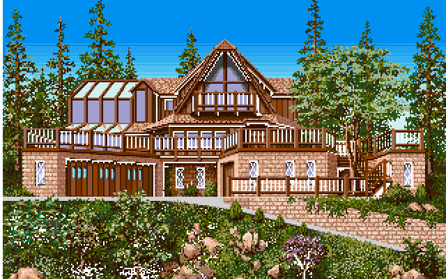
JimSachs_SachsCastle
Printed in Jim Sachs Calendar 1991

Sachs Castle December, 1985
What my house will look like when completed.
(Recently renamed as Sachs Castle 1995)

Sky For outdoor scenes, try to use at least three shades of blue for skies, ranging from medium blue at the top to very light near the horizon. Horizontal bands or clouds can be used to break up the division lines between these colors.

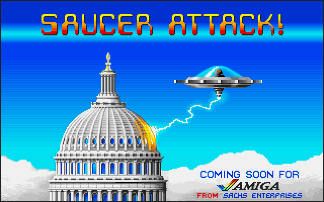
JimSachs_SaucerAttack

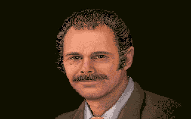
JimSachs_SelfPortrait

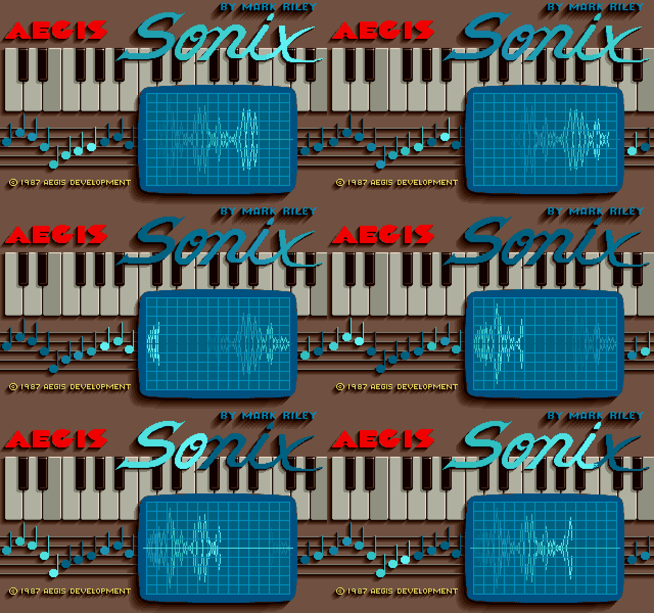
JimSachs_Sonix
JimSachs_Sonix_var
  • Variation
JimSachs_Sonix_var
I'm not sure if this splash screen is genuine, but I've stumbled across this multiple times. It's definitely not by Jim Sachs, but interesting, nonetheless.


JimSachs_TimeCrystal